ASTRAY
Bringing A Founders Vision To Life, Solo.
Under NDA: Some details are anonymized or vague.

Astray began as a tool to help reunite lost pets with their owners.
As the solo designer on the project, I led everything from user flows to high-fidelity visuals. I also helped shape the product’s direction, evolving it into a more community-driven app to increase user engagement and retention.
What is Astray?
My Role
Sole UX/UI Designer
The founder had ambitious ideas (including AI-based paw scanning), but limited resources. My goal was to create something practical, intuitive, and scalable.
The Challenge
Cover
Log In
Create Account - Step

Welcome - Post Account Creation
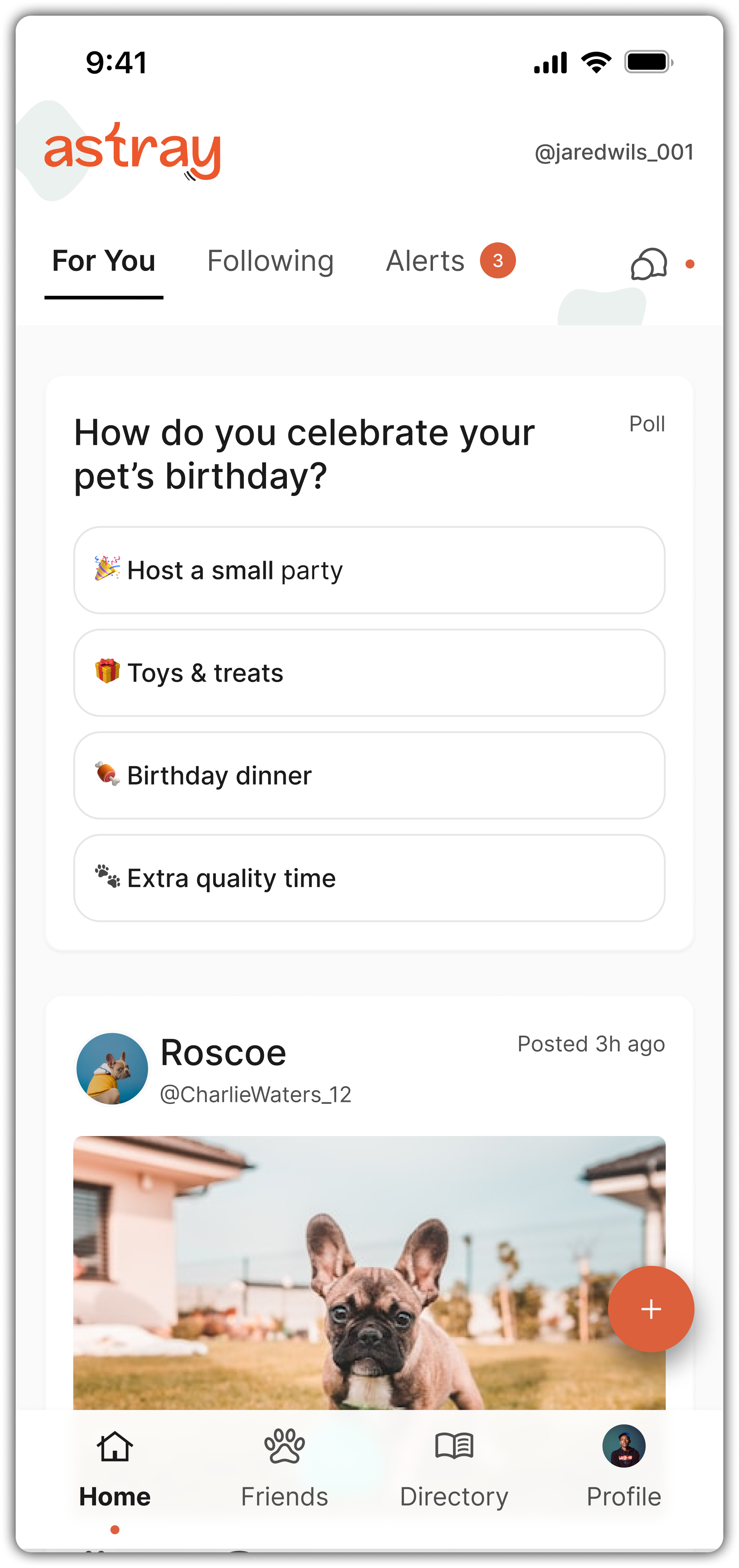
User Feed
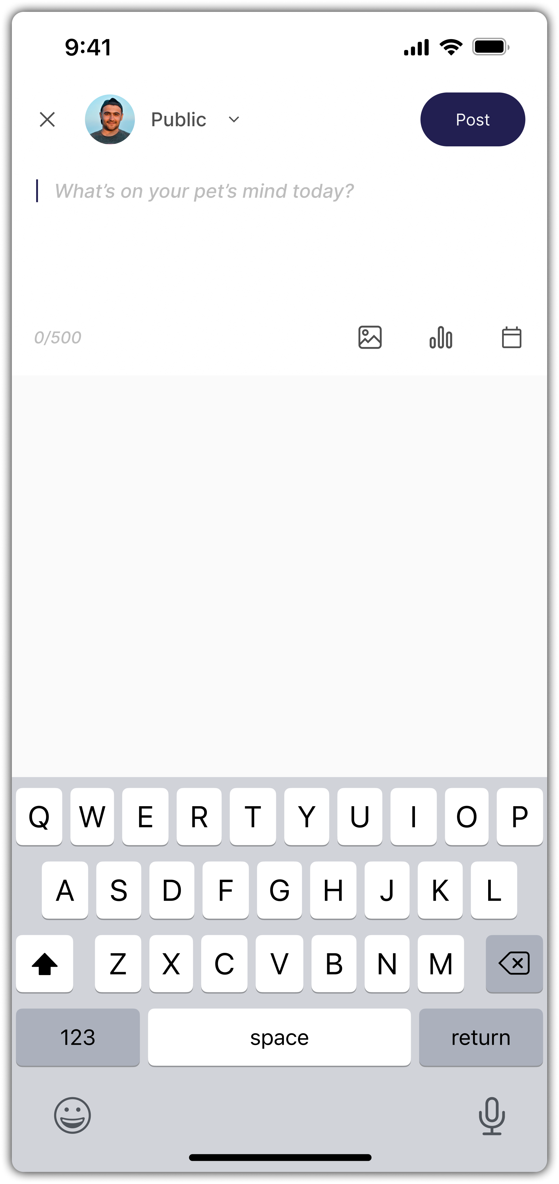
Posting to Feed
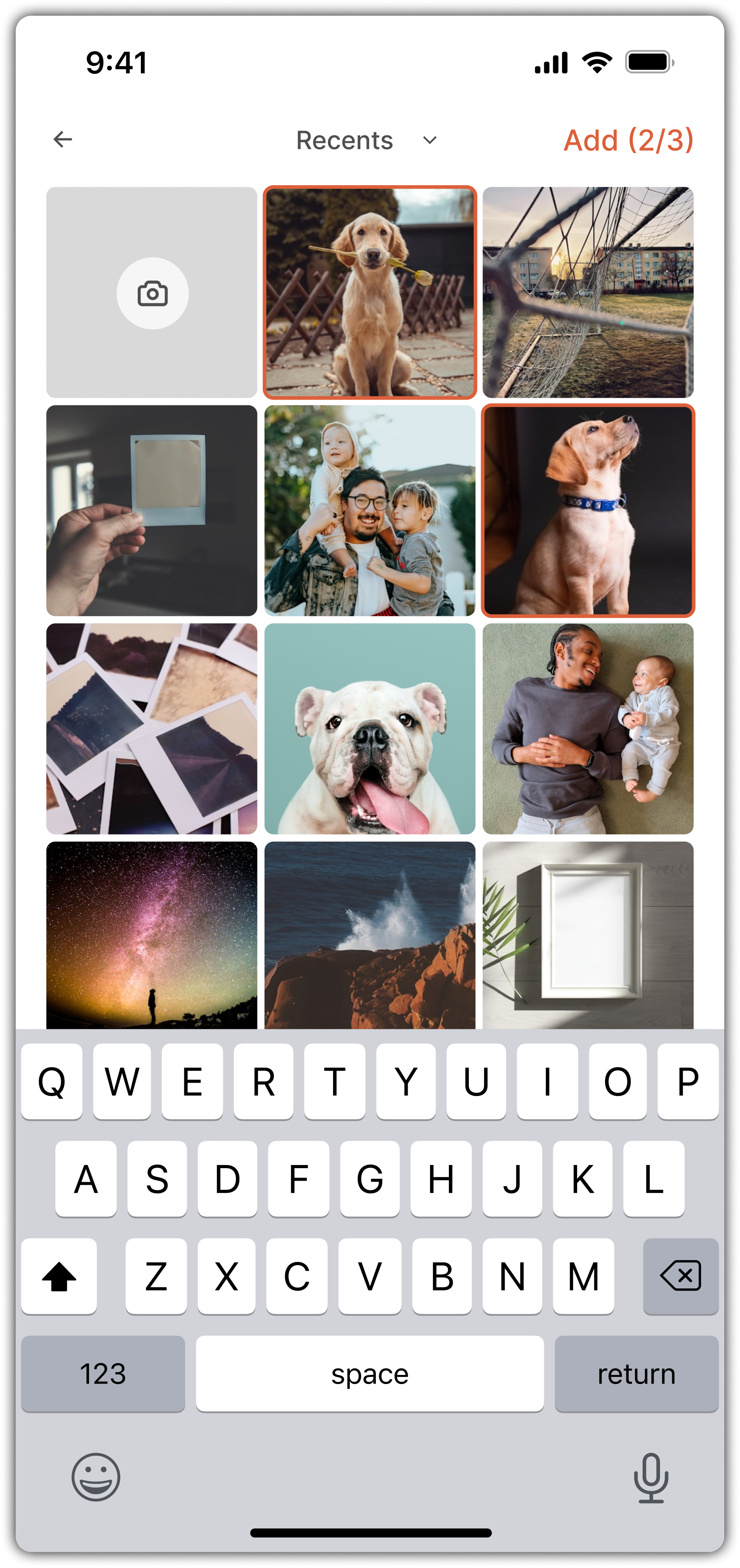
Posting - Photo Selection
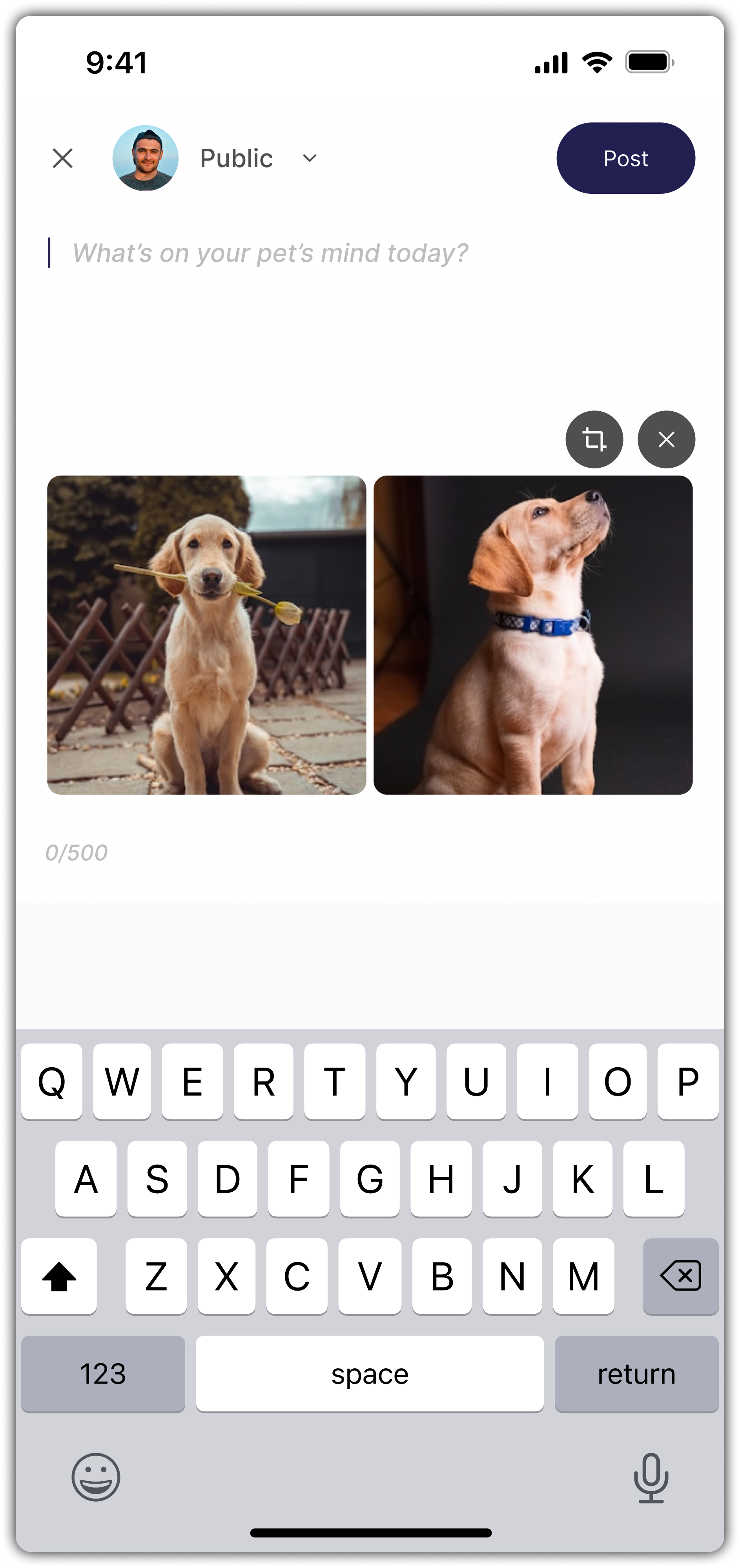
Posting Photos
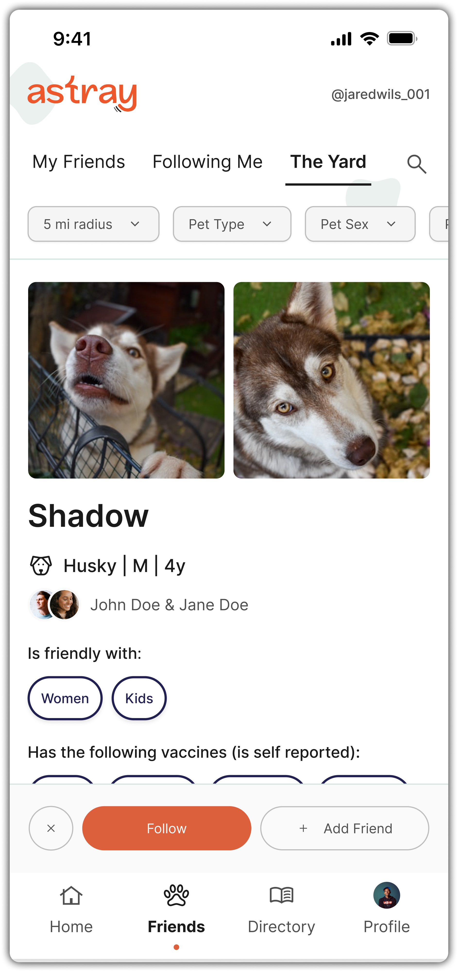
Friends - The Yard (matching)
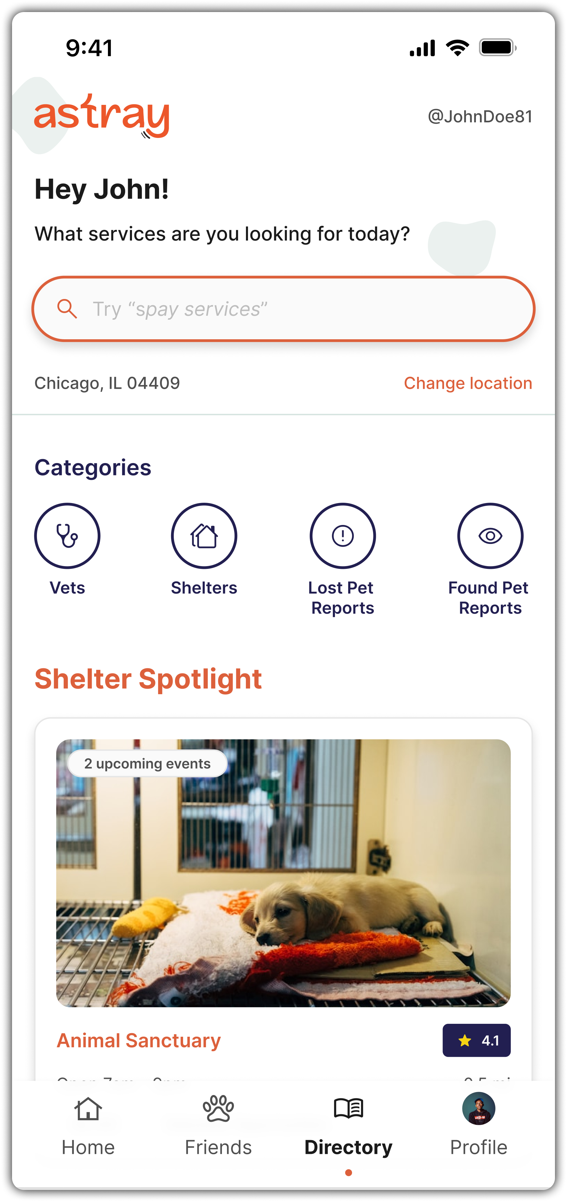
Discovery
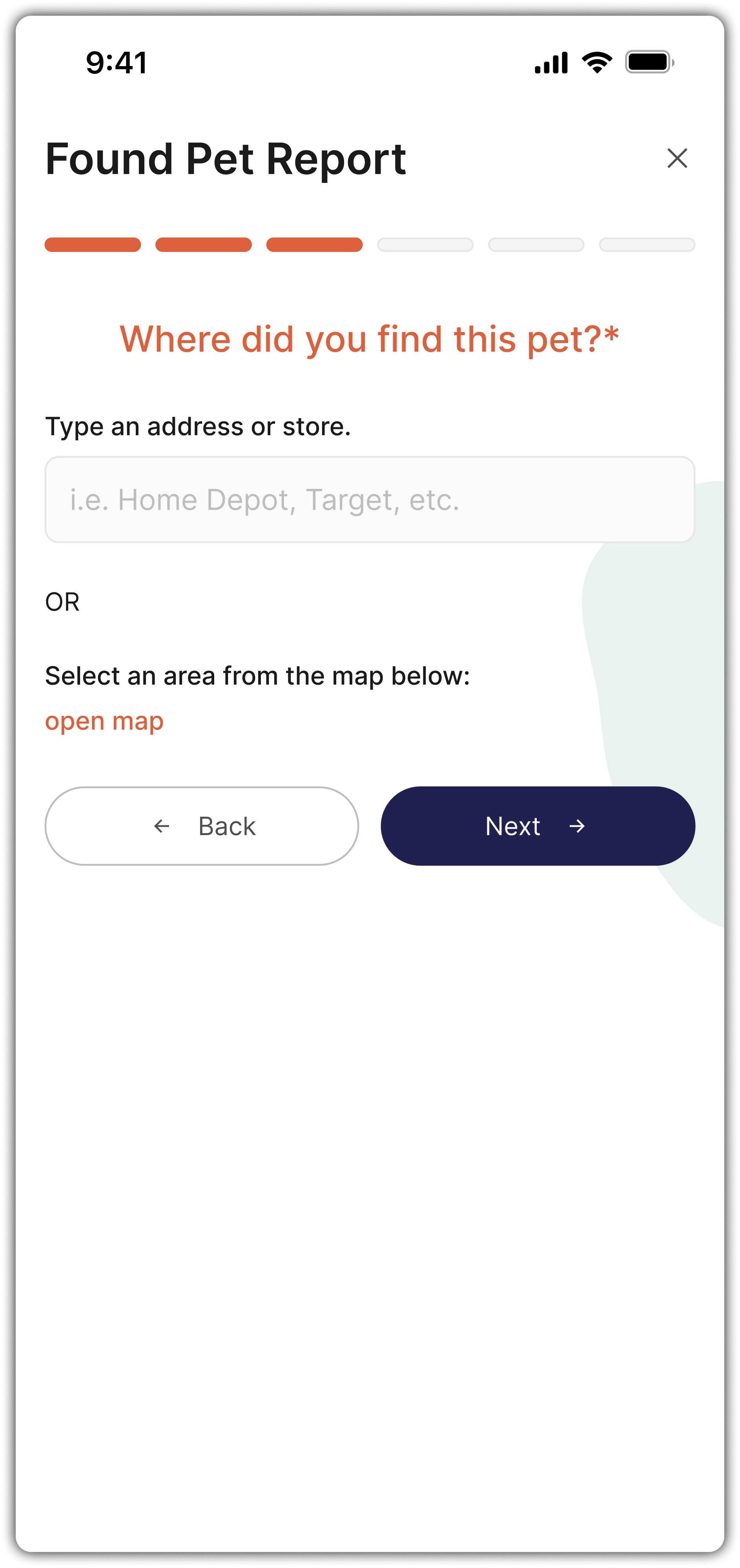
Found Pet Report - Step

Creating An Event
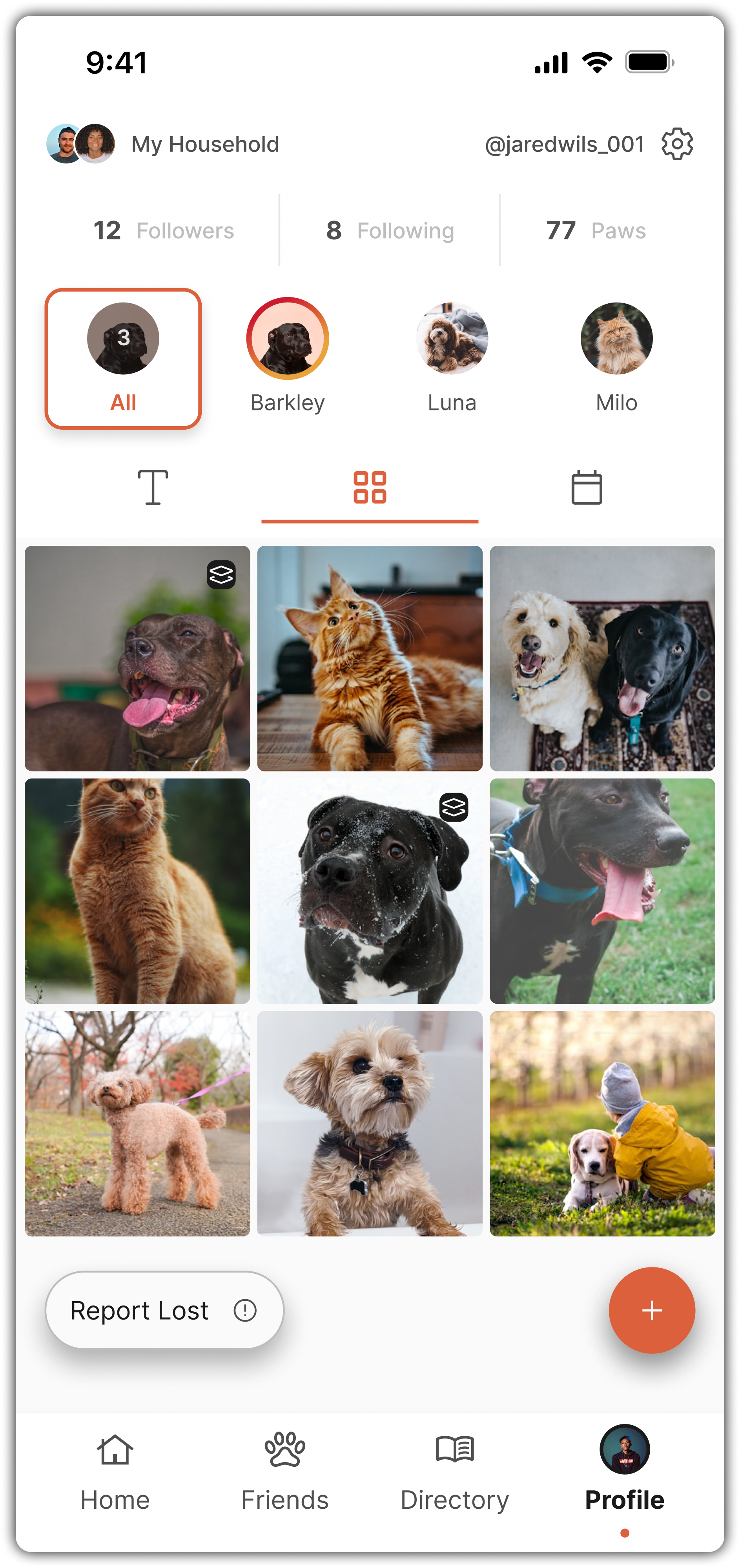
My Profile - Grid View
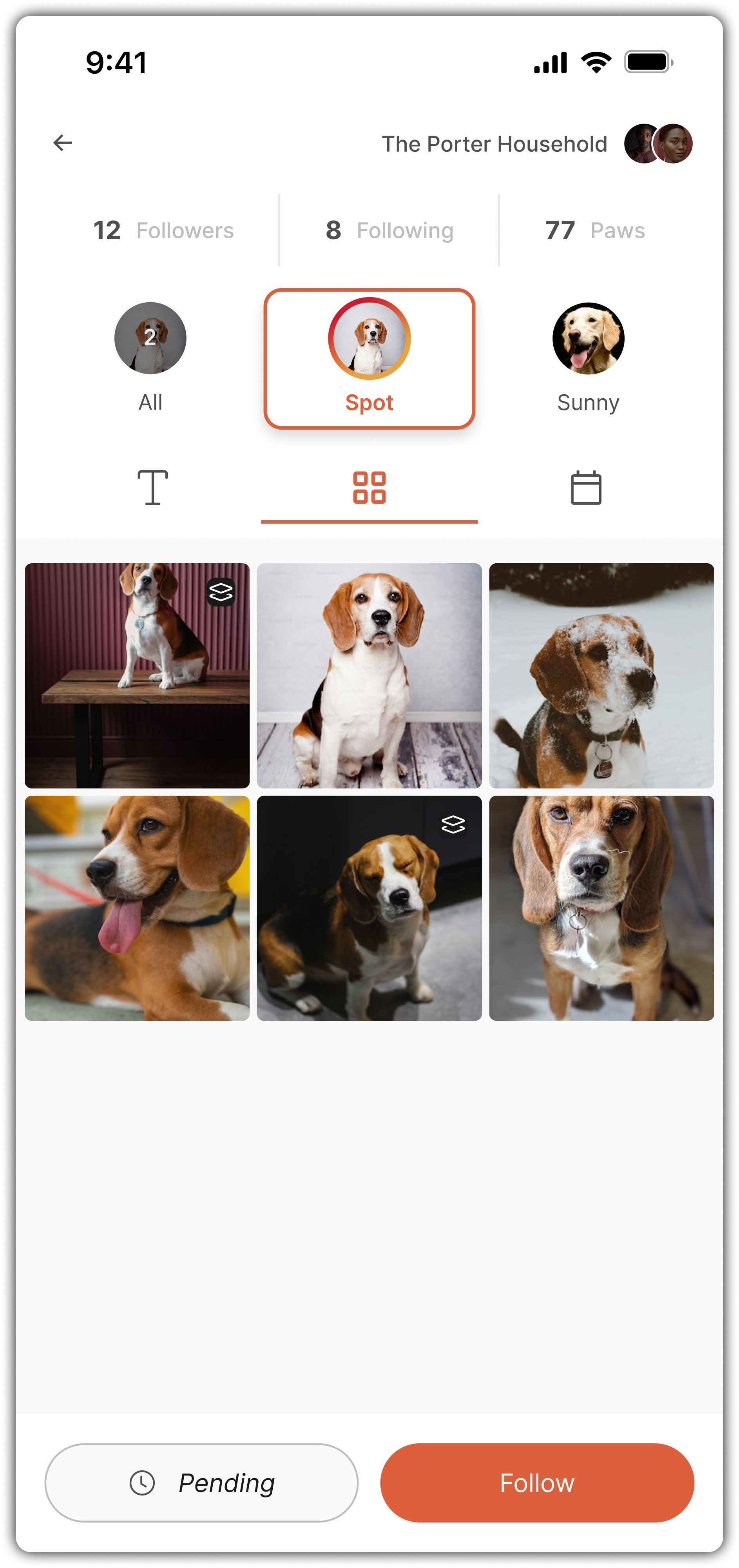
Viewing A Profile
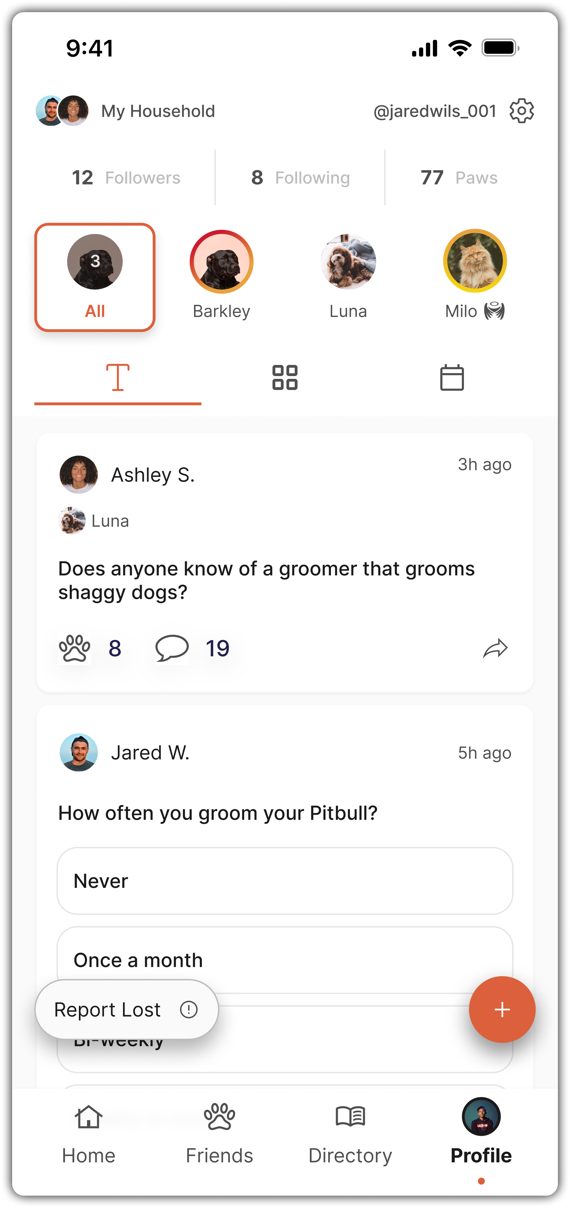
My Profile - Text View
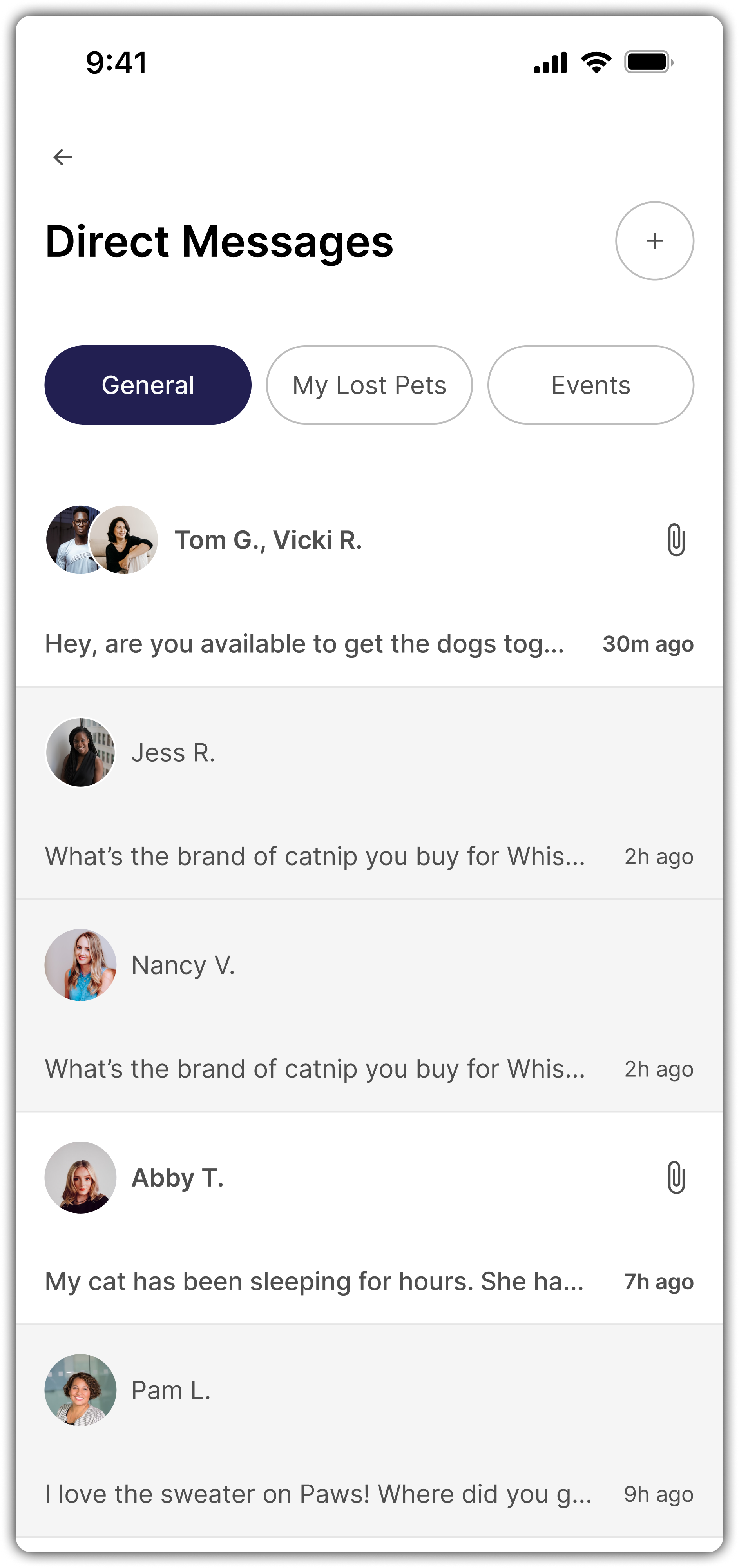
Direct Messages

Discovery

Competitor Research & Vision Alignment
I started the project with light competitor research, identifying gaps in other lost pet apps, particularly their lack of long-term engagement or community-building features.
I shared these insights with the founder and we aligned quickly on one differentiator: Astray would go beyond “utility” and build something people could actually stick with.
Petkey App
PawBoost App
Missing Pets App
Missing Pet App
VS
Astray

Ideation

Product Ideation & Key Decisions
Throughout the design process, I worked closely with the founder to prioritize decisions that balanced usability, scalability, and MVP feasibility.
Below are some of the key decisions made and why they mattered 👇🏾

I. Lost & Found Matching
Simplicity Over Novelty
Idea Explored
Use AI paw scanning or QR codes on collars.
Final Approach
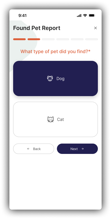
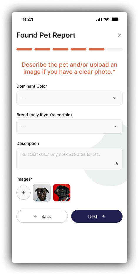
Simplified to description-based matching.
AI was too complex and unreliable for MVP.
QR codes required physical inventory, which is not ideal for an MVP.
🎯 Impact
Focused on fast, scalable matching without hardware or costly tech dependencies.
Reporting Found Pet
Reporting Lost Pet

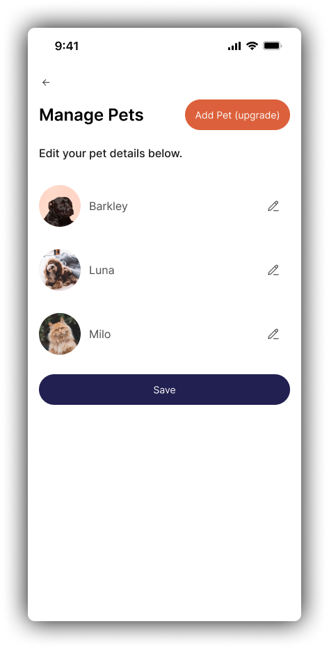
II. Household Accounts
Preventing Duplicate Reports
Problem
How to prevent multiple lost reports for the same pet?
Solution
Built the concept of "Households," allowing multiple users to manage the same pet profiles (similar to Ring or Nest).
🎯 Impact
Prevented duplicate alerts, streamlined user experience, and created a foundation for shared ownership.
Manage Household Settings

III. Alert Prioritization
User Control First
Idea Explored
Backend algorithm to prioritize urgent lost pet alerts.
Final Approach
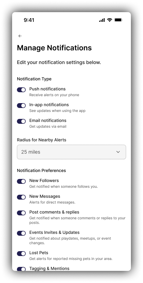
Users can manually set their alert radius by zip code and miles.
🎯 Impact
Gave users more control early on and avoided premature complexity in system logic.
Manage Notifications

IV. High-Risk Pets
User Control First
Idea Explored
Allow users to mark pets as “High Risk”.
Final Approach
Cut feature due to potential emotional backlash and subjective bias.
🎯 Impact
Kept the platform feeling inclusive and neutral, every missing pet matters equally.

V. Vet & Shelter Data
Hybrid Approach
Problem
How to keep third-party data accurate and updated?
Solution
Hybrid model. Some data pulled via public scraping, but shelters and vets could also create and manage their own verified profiles.
🎯 Impact
Balanced data quality with sustainability, and created long-term partnership opportunities for Astray.
Vet/Shelter Account Creation & Info Page

Mapping Out the MVP’s Functionality
After clarifying the app’s goal & direction, I mapped out core user flows to establish structure early.
This helped prevent scope creep and ensured the MVP was focused but extensible.
I kept each flow focused, humane, and easy to follow, especially during moments when users may be overwhelmed or stressed.
User Flow Documentation Deliverable
User Flow Deliverables

Design

Building A Scalable Design System
This included:
A clear, accessible color palette (with warm, friendly tones)
Type styles for headers, body text, and inputs
Reusable components like buttons, modals, and cards
Iconography
This helped speed up iteration in later phases and ensured a consistent, polished UI throughout.
A Few Component Examples

Hi Fis & Iterations
While time constraints didn’t allow for full low-fidelity exploration, I used flow mapping and rapid iteration within the design system to move quickly into high-fidelity mockups, with two rounds of focused feedback and refinement.
Various updates were made, but below are 4 made throughout the iterations 👇🏾

I. Directory Page
From Static List to Discovery Hub
Before:
One list view
Only two tabs ("Vet" and "Shelter")
After:
Smart search functionality
Filter by Vets, Shelters, Lost Pets, Found Pets
Spotlight feature highlighting trusted partners
Visual-rich item cards with specialization tags
🎯 Impact
Made the app feel more alive, searchable, and relevant for users beyond just scrolling.
➡️

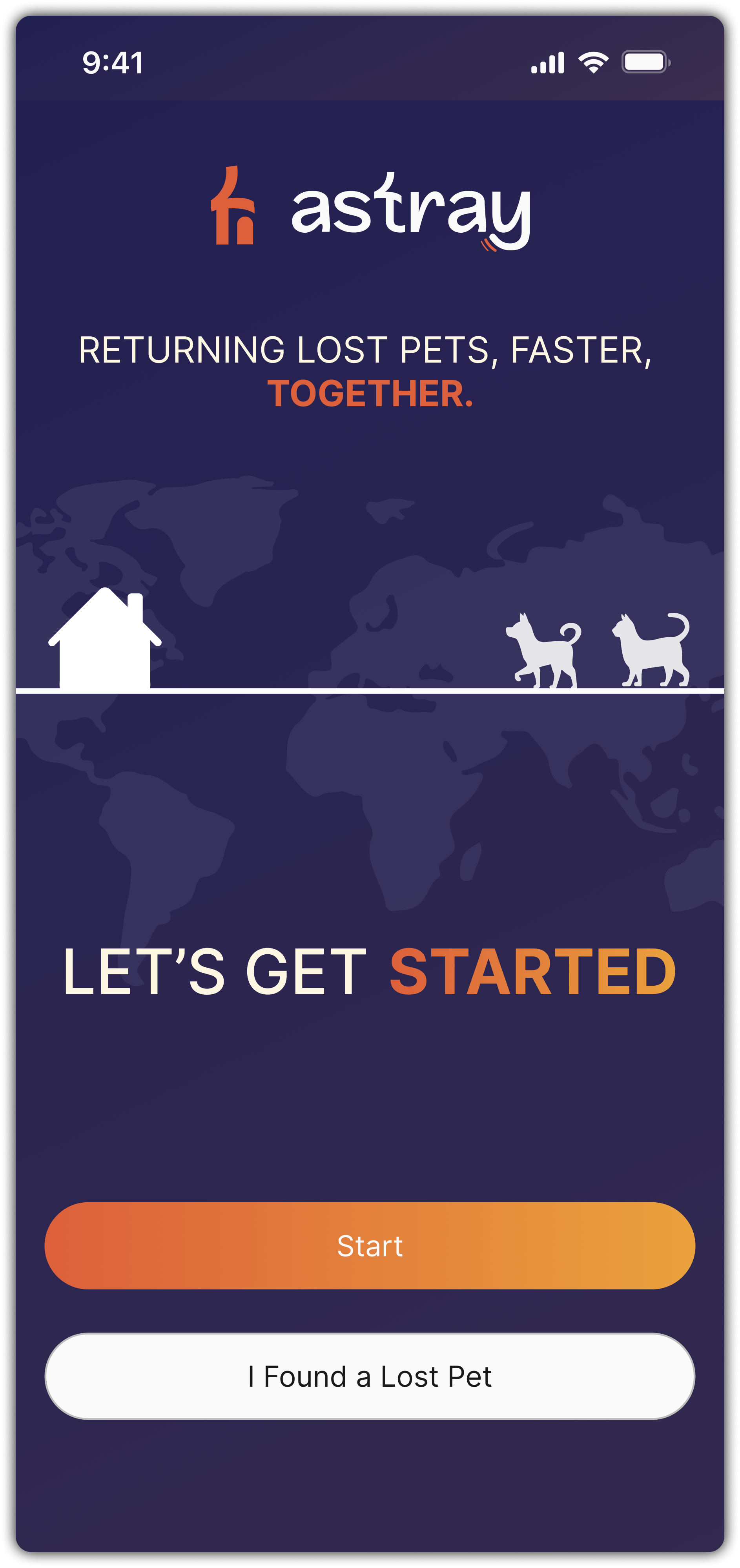
II. Cover Page Addition
A Friendlier First Impression
Before:
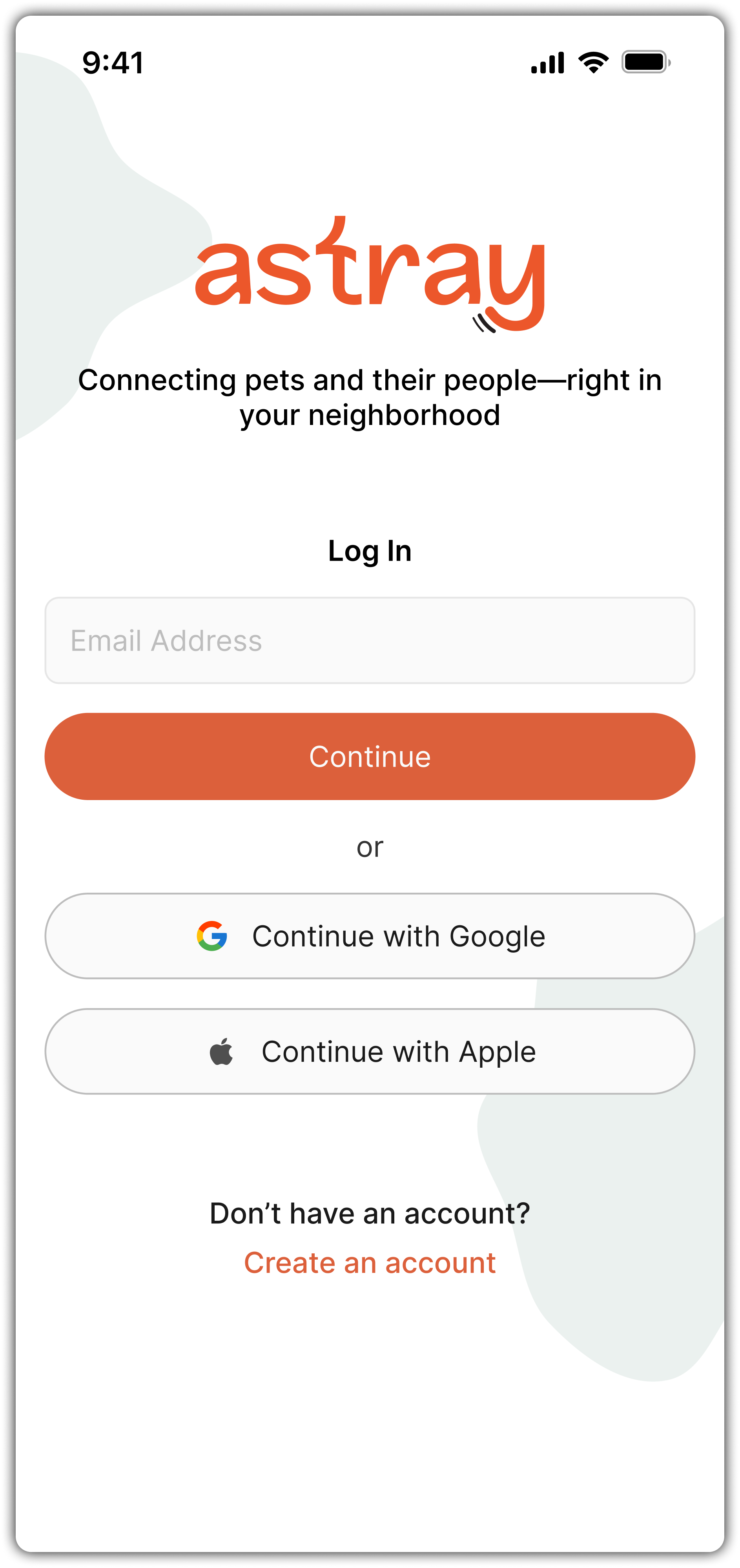
App launched straight into login screen
After:
Added Cover Page with immediate “Report Found Pet” option
"Get Started" CTA flows into sign-in/signup
More welcoming for first-time users or urgent cases
🎯 Impact
Created an emotional connection and a faster path for action, even before account setup.
➡️

III. Friends Discovery
Card-By-Card Connections
Before:
Flat list of users and pets
After:
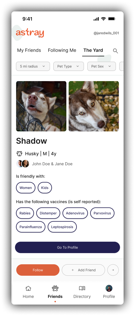
One profile displayed at a time (in a card layout)
Larger pet photos and clear owner info up front
Users actively choose: "Add Friend," "Follow," or "Next" to view the next profile
🎯 Impact
Created a more thoughtful and personal discovery experience.
Instead of endless scrolling or quick swipes, users are encouraged to make intentional connections with pets and owners they care about.
On Scroll

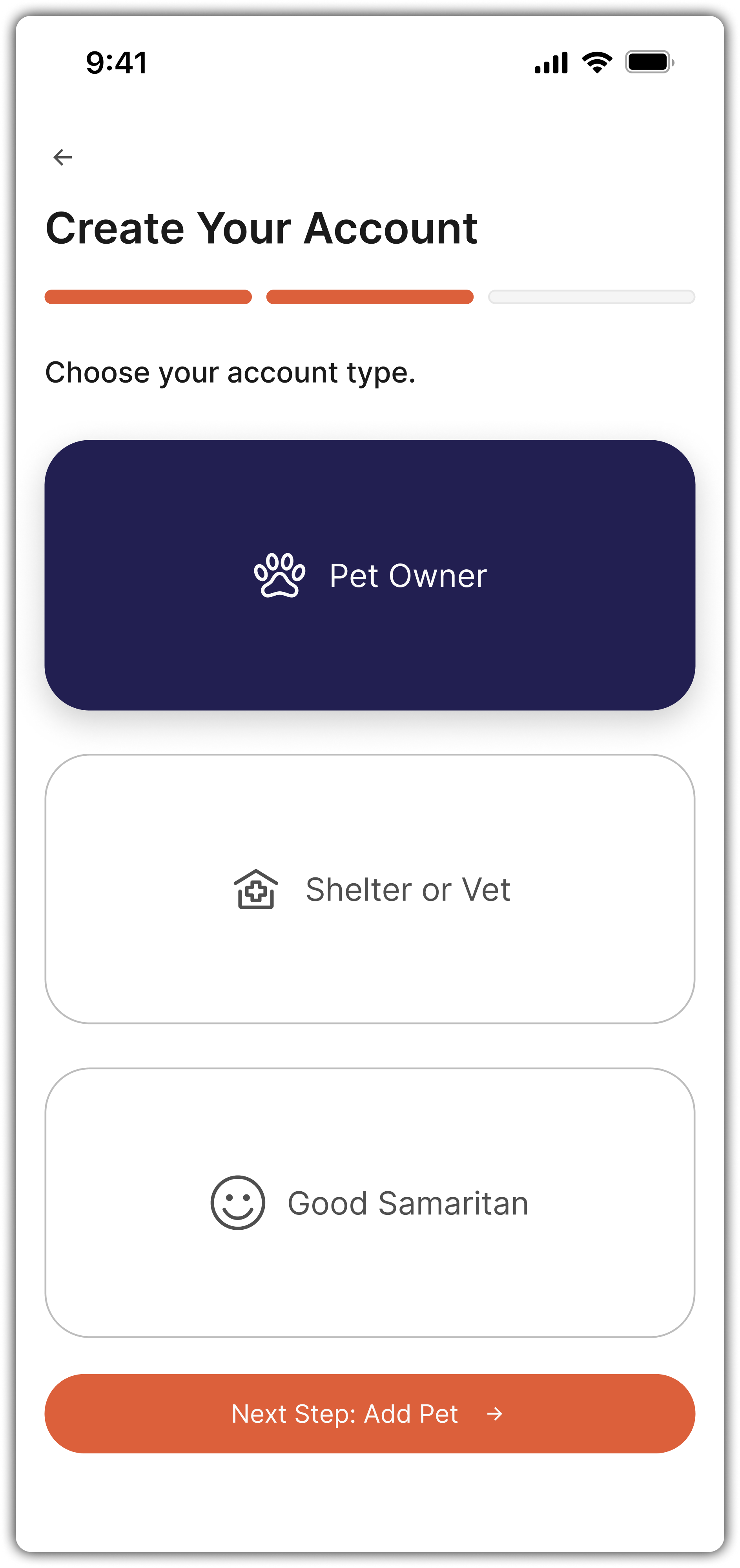
IV. Expanded Roles & Sensitivity Features
As we iterated, it became clear that a single account type wasn’t enough. I expanded the sign-up flow to allow:
Pet Owners
Shelters & Vets
Good Samaritans
Additionally, we added a sensitive way for users to mark a pet as deceased. Honoring the emotional realities of pet ownership without erasing important memories.
🎯 Impact
Made the app more inclusive and compassionate for all potential users.

Prototyping

I built a clickable Figma prototype that the founder could share with stakeholders and future developers.
It covers all core flows and supports future usability testing and investor demos.

Handoff & Support

I wrapped the project up with:
An organized Figma file & prototype,
A clean component library,
The final deliverable documentation outlining interaction notes and edge cases.
All assets are ready for engineering, and I’ll be available to support development once a dev is brought on.
Figma Components Panel
Final Deliverable Documentation - Cover & Pg 1

Reflection

Astray gave me the rare opportunity to own a product experience from scratch, not just designing it, but shaping it. Working directly with an early-stage founder under budget and time constraints meant I had to be both creative and pragmatic. I had to balance “blue-sky” vision with realistic execution.
Here’s what I took away from the process:
Lead with empathy.
People using this app are likely stressed, emotional, or overwhelmed. Every screen had to feel supportive, not transactional.Community is a feature, not a bonus.
Encouraging ongoing engagement through social features wasn’t just a nice-to-have, it was the key to making the app sustainable long-term.The MVP matters.
Cutting back on “dream features” like AI let us focus on what mattered most: speed, clarity, and connection.
I’m proud of the clarity and polish in this work, but even more proud of the product thinking that drove it, and the founder’s trust in me to bring it to life solo.


