
Sittercity
Improving Post-Onboarding Activation in a Two-Sided Marketplace

Under NDA: Some details are anonymized or vague.

Sittercity is a 2-sided marketplace that primarily connects families seeking childcare with sitters looking for work.
What is Sittercity?

My Role
Senior Product Designer
After completing onboarding and posting a job, families were sent directly to the homepage with little guidance on what to do next.
Internal data revealed that families who invited sitters were 2x more likely to convert to premium, yet the product experience did not surface or encourage this behavior at the right moment.
The Challenge

My Team
1 Product Manager
1 Tech Lead
1 Backend Engineer
2 Frontend Engineers
Cover
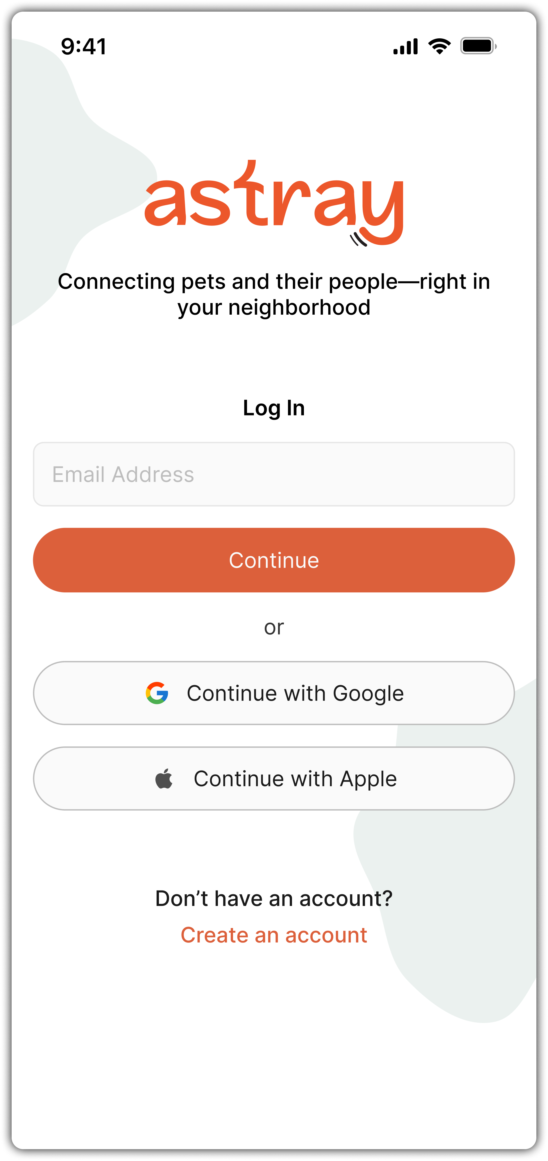
Log In
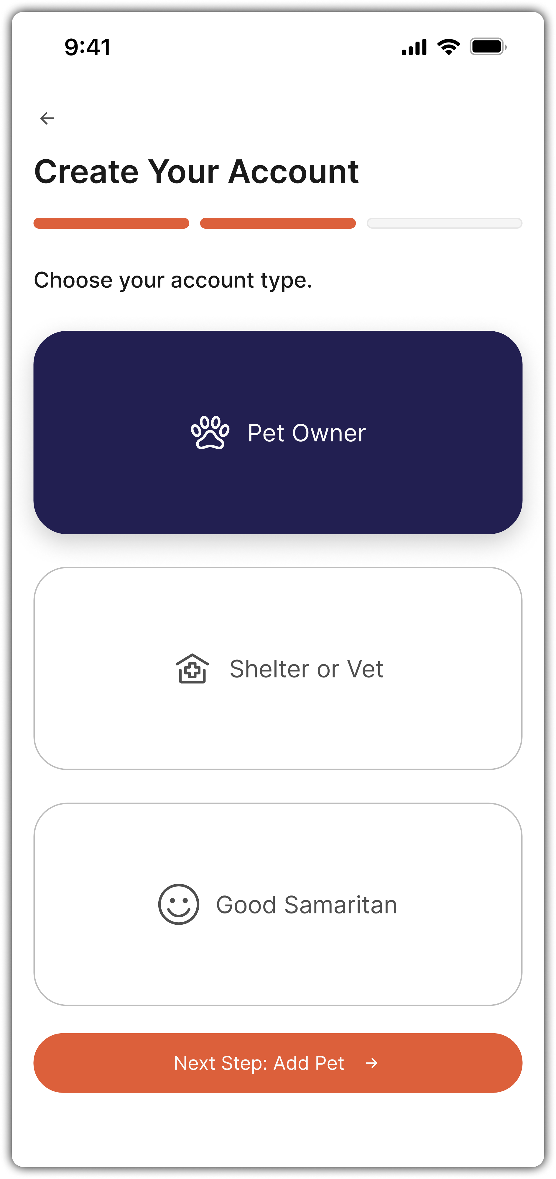
Create Account - Step

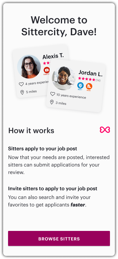
Welcome - Post Account Creation
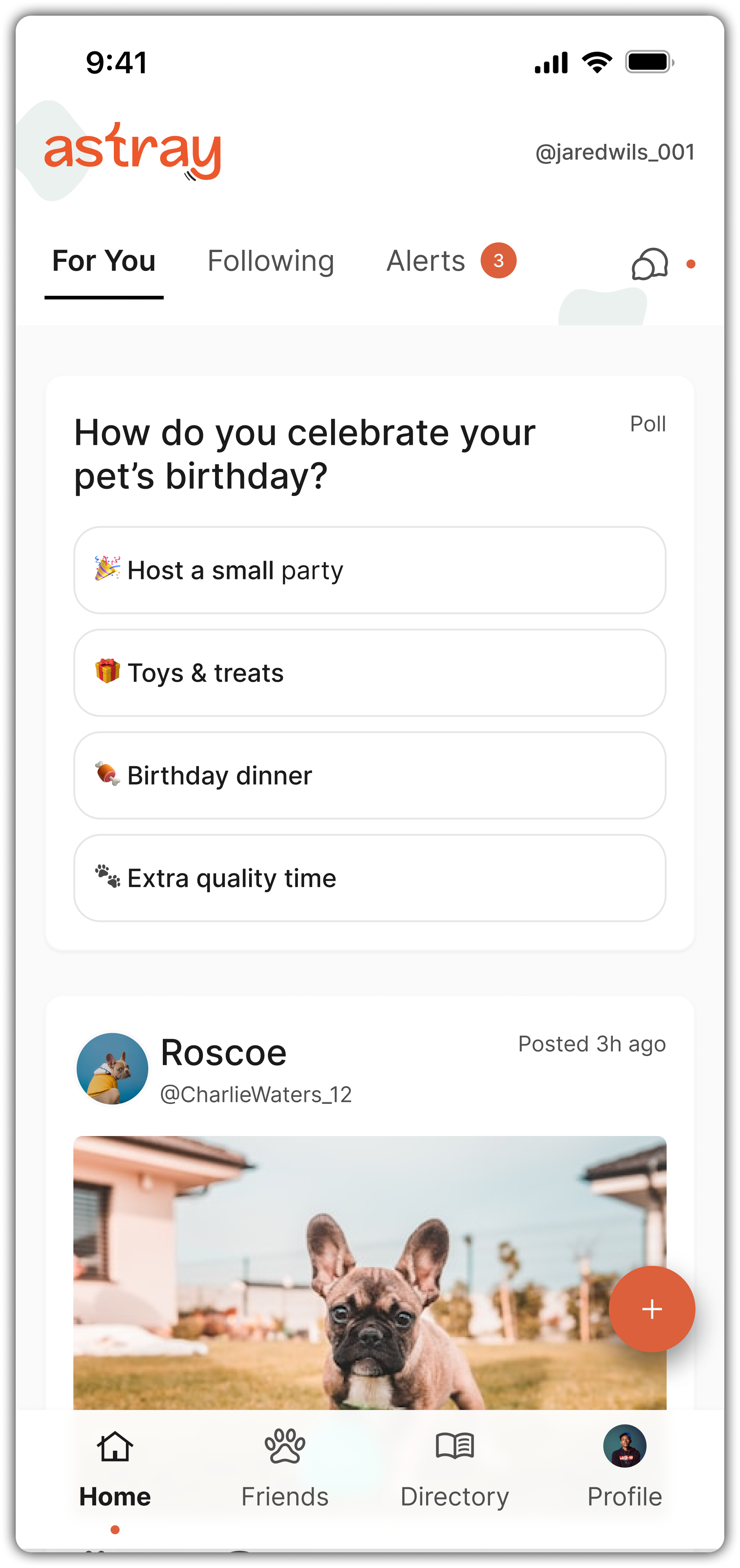
User Feed
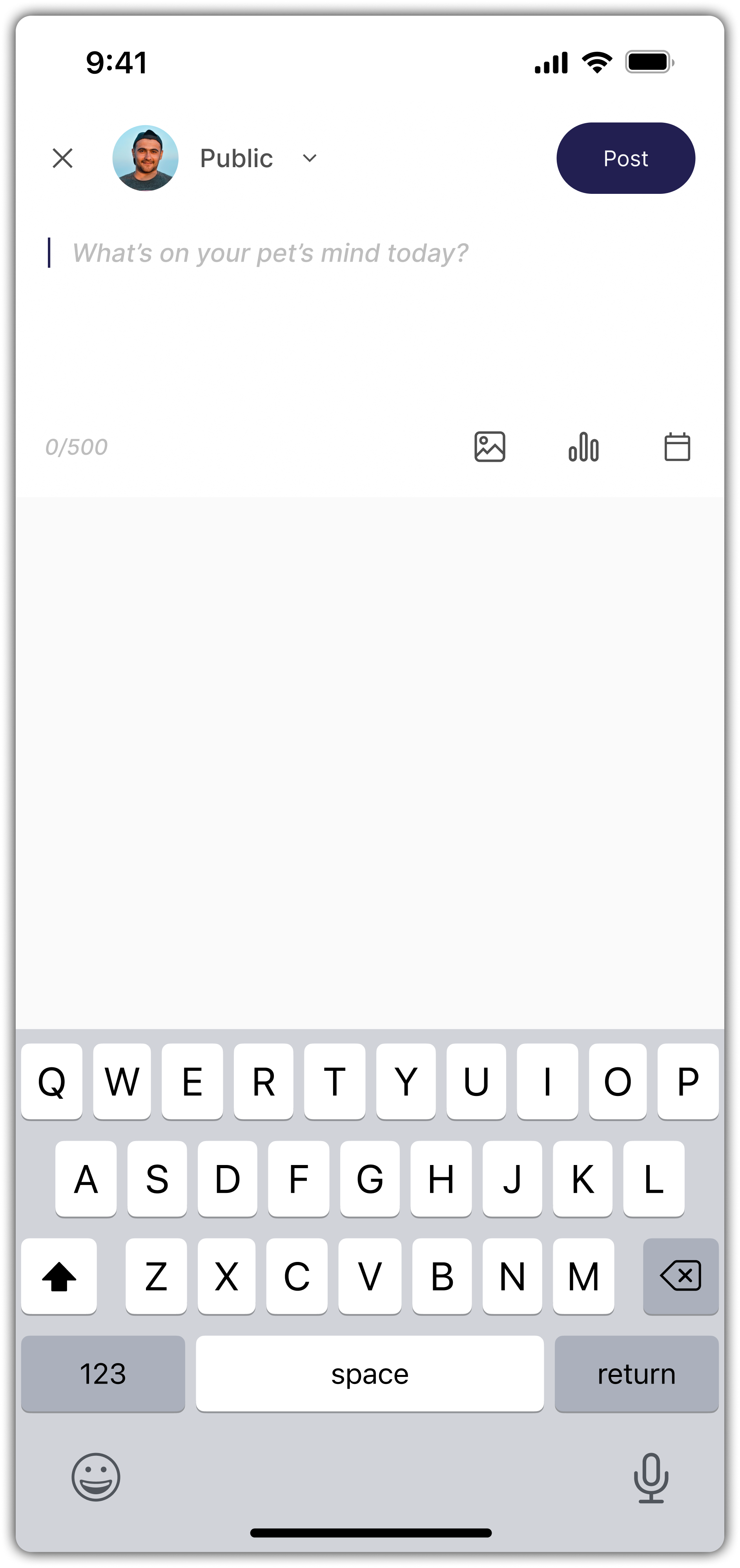
Posting to Feed
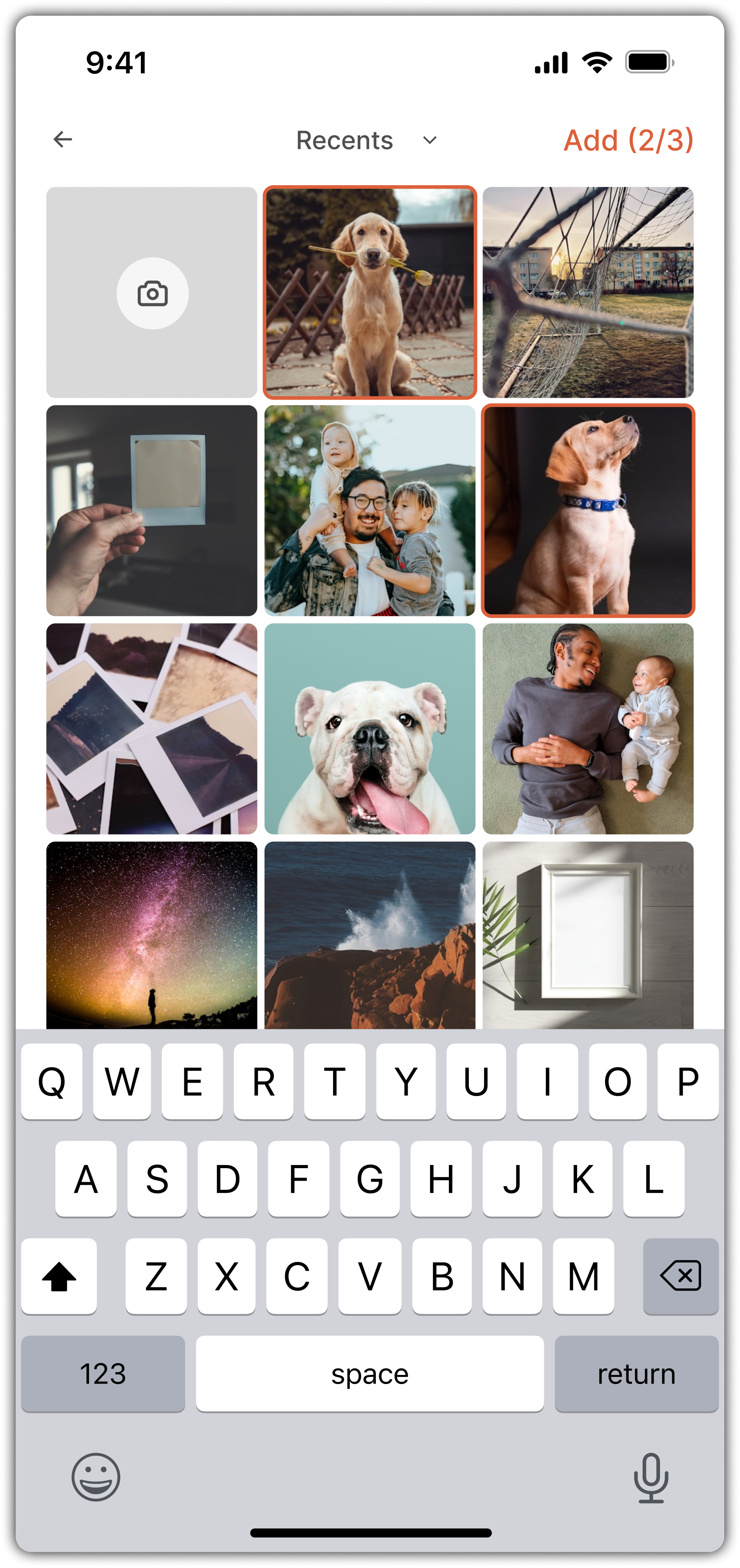
Posting - Photo Selection
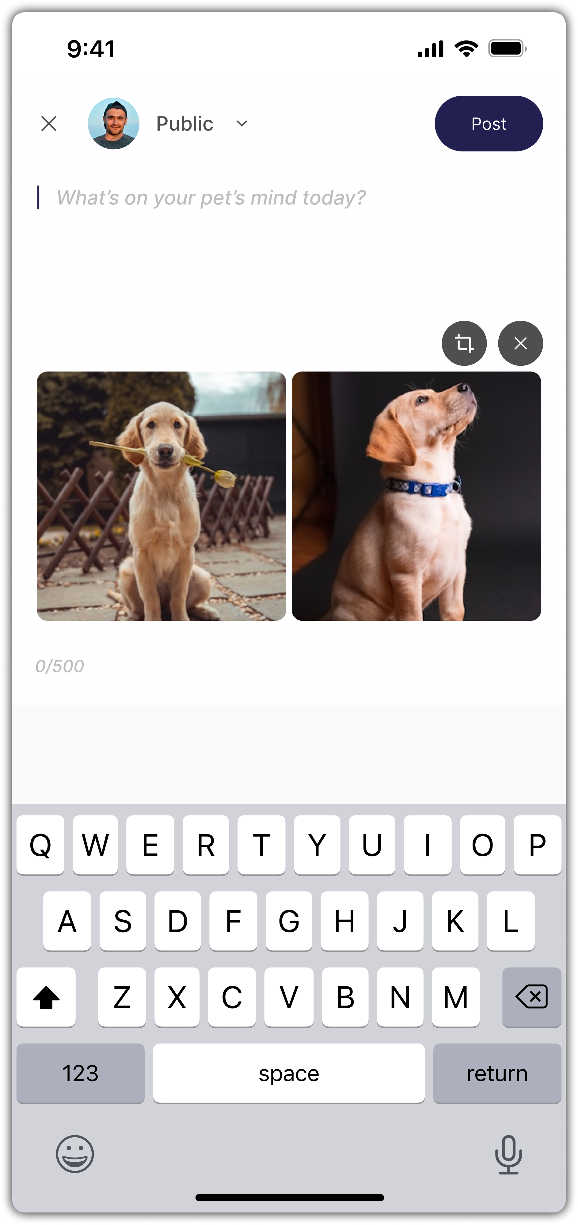
Posting Photos
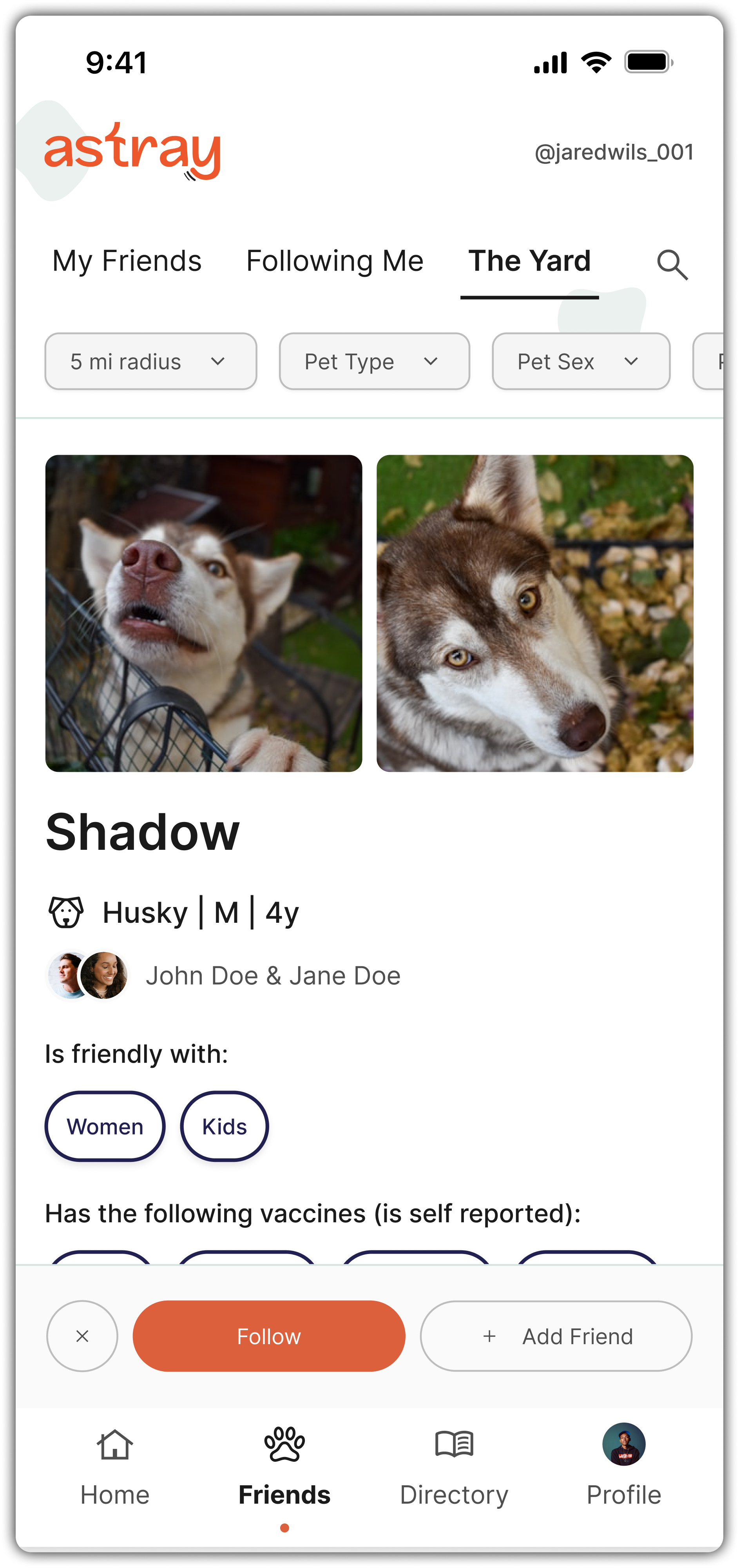
Friends - The Yard (matching)
Discovery
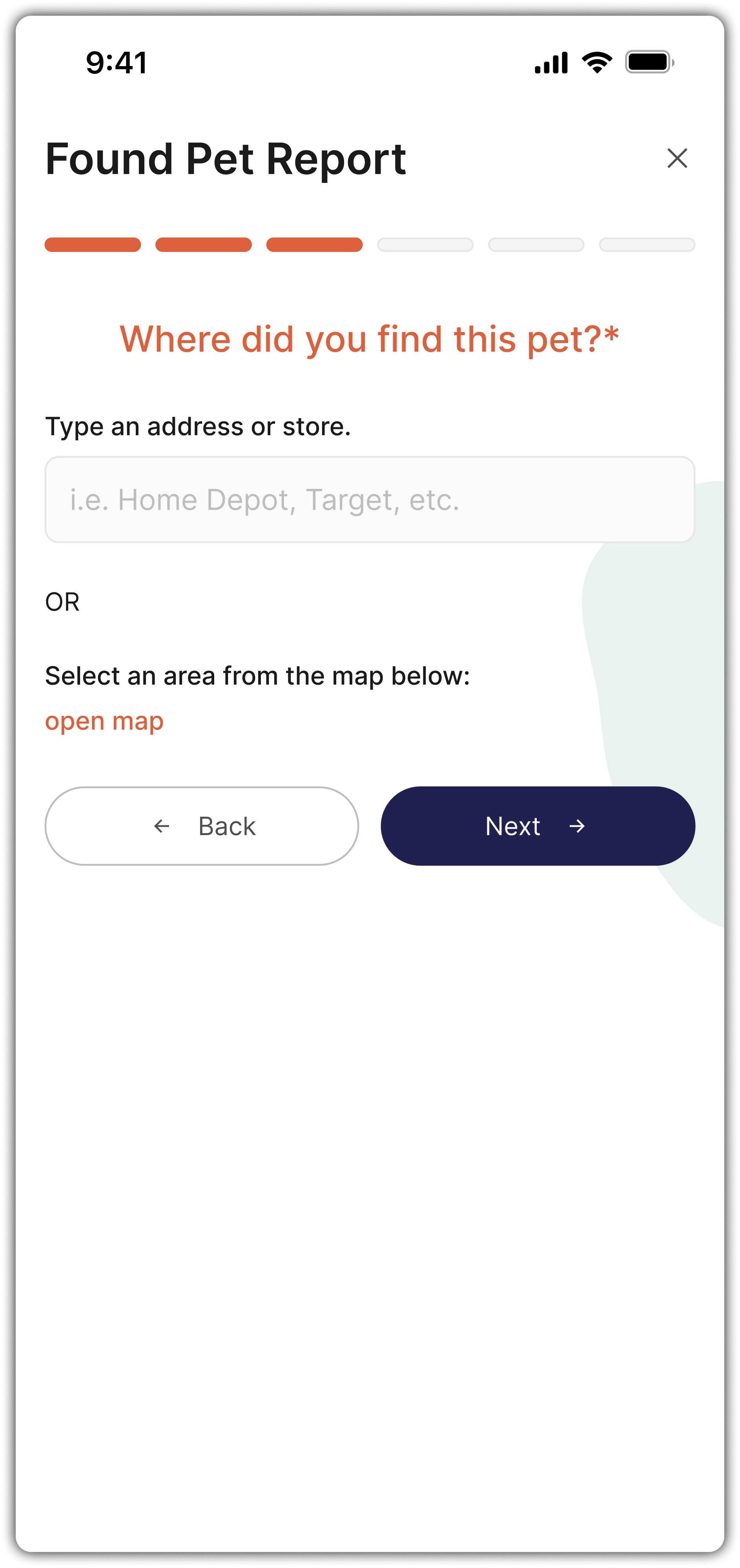
Found Pet Report - Step

Creating An Event
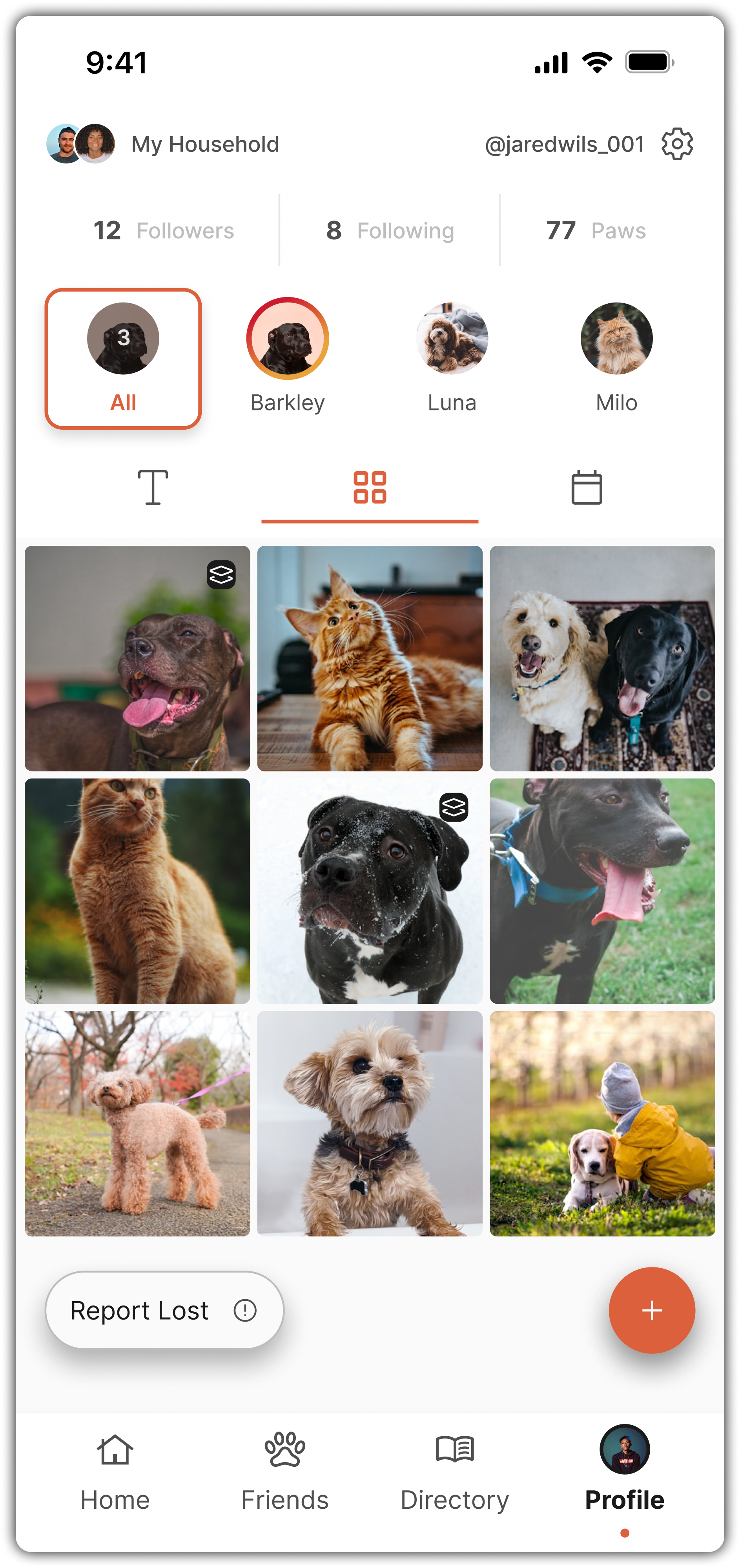
My Profile - Grid View
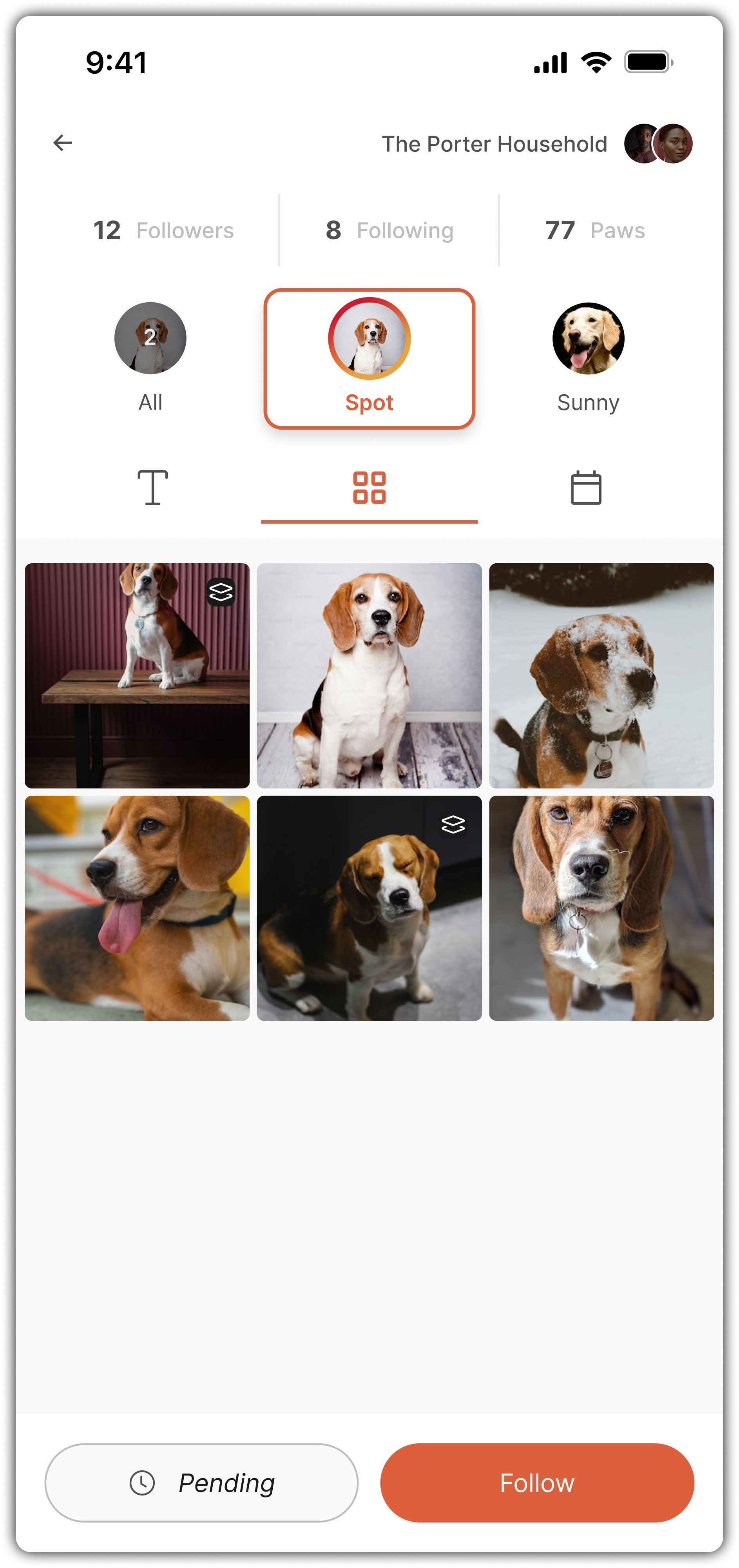
Viewing A Profile
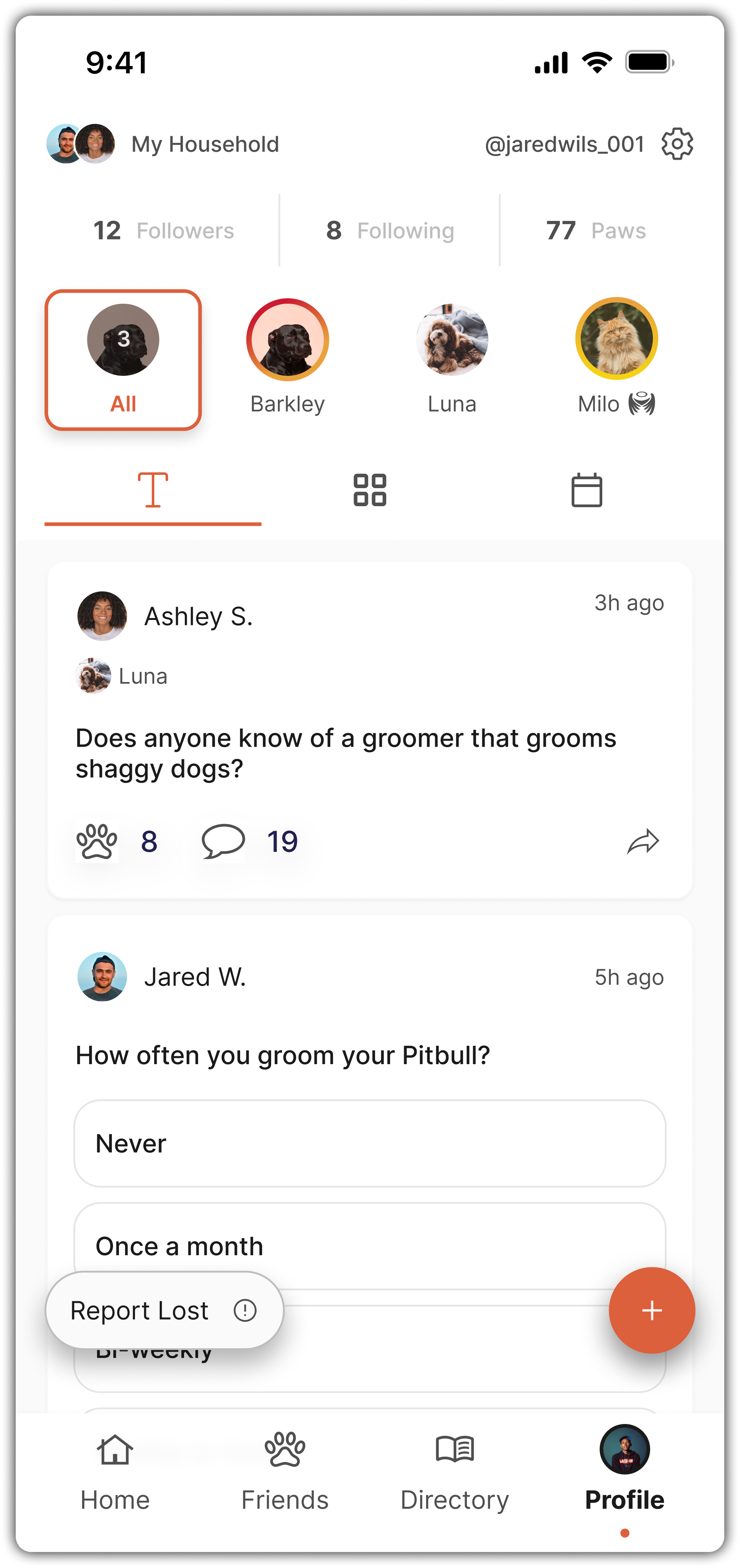
My Profile - Text View
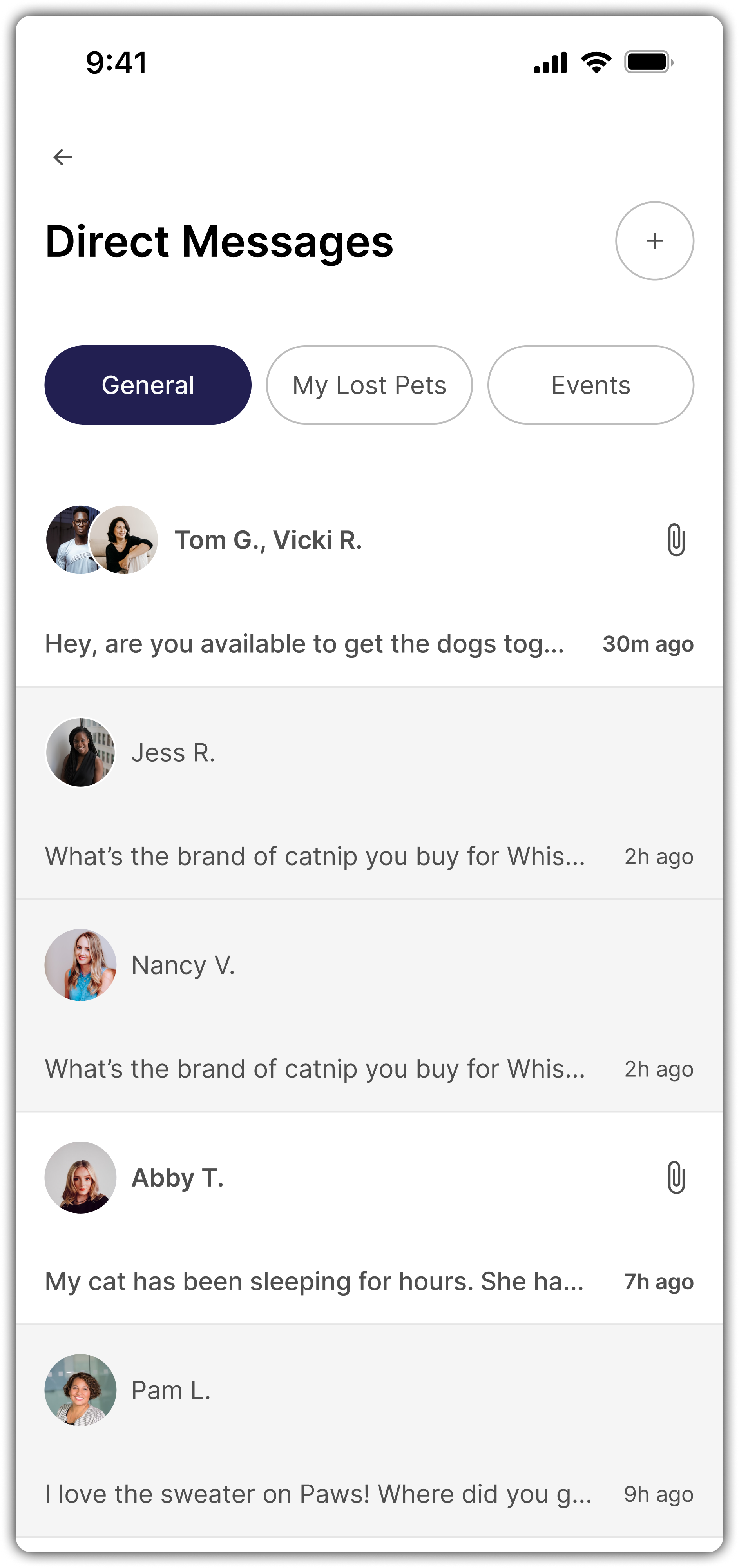
Direct Messages

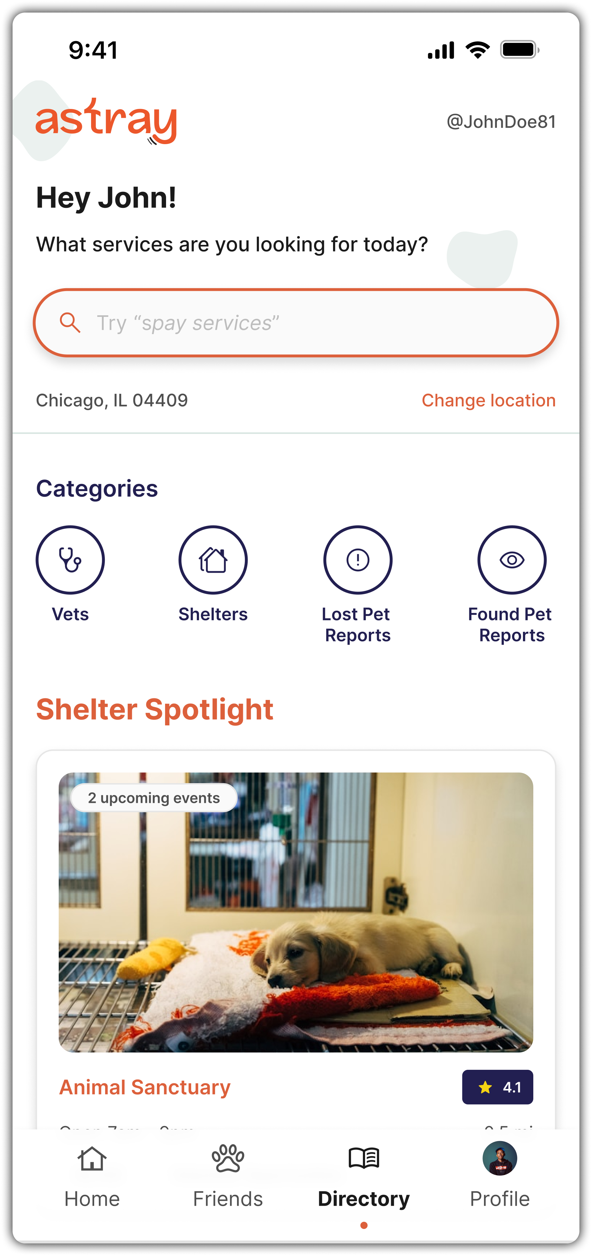
Discovery + Insights
Data Insight
Product analysis showed that families who invite sitters to apply to their posted job vs those who wait for sitters to apply on their own are 2x more likely to convert to a premium subscription
(this is one of Sittercity’s main revenue streams)
Competitive Research
Platforms like Care.com & UrbanSitter:
Introduce users to how the marketplace works immediately
Route families directly into sitter search after job posting
Avoid dropping users onto a generic homepage
Design Goals
Design Goals
Educate families on how SitterCity works
Reduce friction between job posting and sitter discovery
Encourage high-intent actions tied to conversion
Preserve user context across navigation
Create momentum immediately after onboarding
The Solution
I designed a new post-onboarding “Get Started” experience that intentionally guides families from job posting into sitter discovery and engagement.
I. Welcome to SitterCity Flow
After posting a job, families are introduced to the platform with a short walkthrough that:
Explains what happens next
Clarifies 2 paths:
Wait for sitters to apply
Invite sitters directly (positioned as a recommended action)
II. Transitional Loading State
A brief “we’re finding sitters that match your needs” state reassures families that:
Their job details are being used
The platform is actively working on their behalf
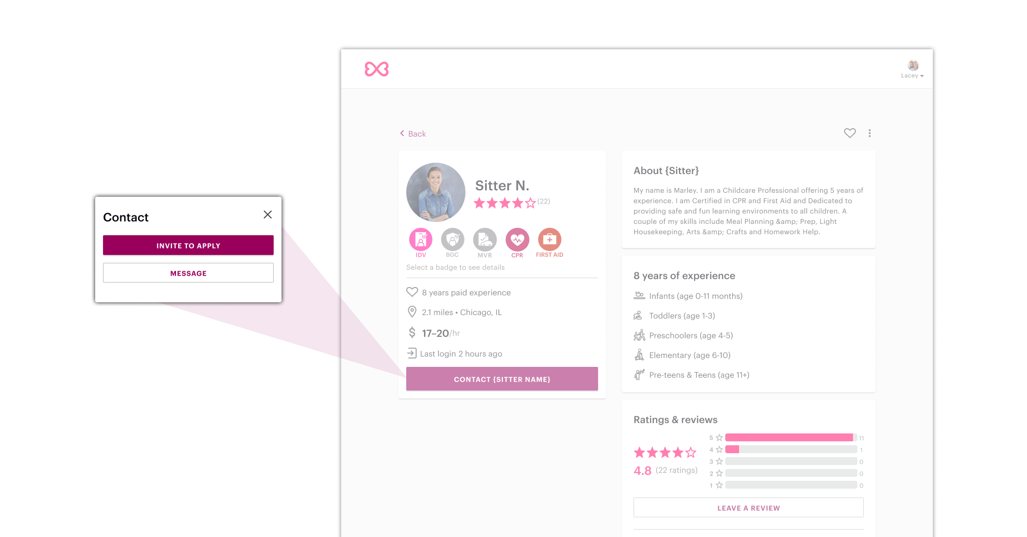
III. Immediate Entry Into Sitter Search
Families are taken directly to a pre-filtered sitter results page showing:
The number of sitters matching their criteria
A small curated preview to get started
Clear paths to view profiles or browse all sitters
This removes unnecessary steps and keeps users in context.
IV. Job-based Sitter Search Filter
To preserve momentum over time:
Families with an open job can filter sitter search by that job
Criteria is retained even if users leave and return later
V. Homepage Get Started Checklist
For continued reinforcement, a 3-step checklist was added to the homepage:
Post a job (already completed to create early momentum)
Add family photos (data-backed increase in sitter responses)
Invite sitters to apply
Outcome + Impact
I built a clickable Figma prototype that the founder could share with stakeholders and future developers.
It covers all core flows and supports future usability testing and investor demos.
Handoff & Support
I wrapped the project up with:
An organized Figma file & prototype,
A clean component library,
The final deliverable documentation outlining interaction notes and edge cases.
All assets are ready for engineering, and I’ll be available to support development once a dev is brought on.
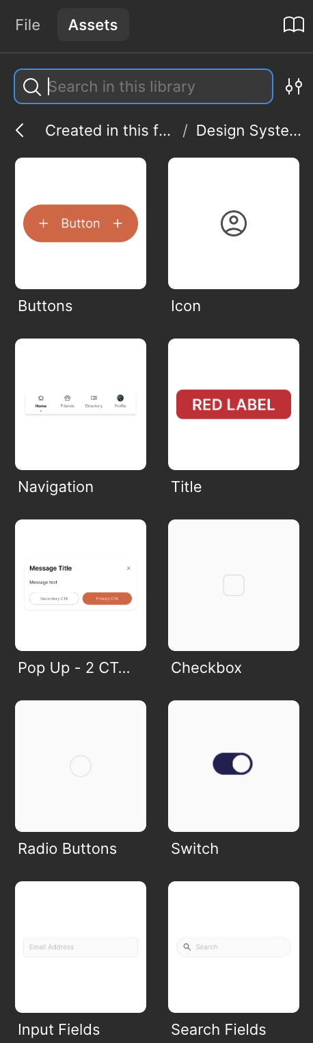
Figma Components Panel


Final Deliverable Documentation - Cover & Pg 1

Reflection
Astray gave me the rare opportunity to own a product experience from scratch, not just designing it, but shaping it. Working directly with an early-stage founder under budget and time constraints meant I had to be both creative and pragmatic. I had to balance “blue-sky” vision with realistic execution.
Here’s what I took away from the process:
Lead with empathy.
People using this app are likely stressed, emotional, or overwhelmed. Every screen had to feel supportive, not transactional.Community is a feature, not a bonus.
Encouraging ongoing engagement through social features wasn’t just a nice-to-have, it was the key to making the app sustainable long-term.The MVP matters.
Cutting back on “dream features” like AI let us focus on what mattered most: speed, clarity, and connection.
I’m proud of the clarity and polish in this work, but even more proud of the product thinking that drove it, and the founder’s trust in me to bring it to life solo.
