
Famble
How My Research & Testing Shaped a B2C Mobile App.


What is Famble?

Famble is a B2C mobile app that helps adults prioritize and organize quality time with loved ones.
My Role
UX/UI Designer
The Task

The Process
Discovery
Ideation
Design
Testing
Impact
Research and design a solution to help adults spend more quality time with loved ones through a mobile application.


Discovery
Secondary Research
My research revealed that while spending time with loved ones is a priority for adults, maintaining these relationships is challenging due to the time and effort required, which many adults lack.
Discovery
"You've figured out how to maximize the little time you do have now, and you simply can't make time for every friend you know"
-TheAdviceable.com, April 2022
"Adult friendships require you to go out of the way and take out time and effort to maintain them.
-TheFridayTimes, June 2022
Research Quotes
Primary Research
The main goal of the research is to evaluate how people who have competing priorities manage their relationships and understand how to help them improve how they prioritize them.
Discovery
1. Screener Survey
Participants needed to:
Requirement 1 - be 18+ years old
Requirement 2 - have at least 1 close friendship that they deem as "important"
Requirement 3 - feel that time spent together is necessary to maintain close friendships
User Interview Questions

11. User Interviews
I interviewed 5 respondents met the requirements. I split the interview into two sections: relationships & time management.
I wanted to gather overall feelings & expectations about close knit friendships and what it takes to be/have a close friend, and then gain an understanding of what priorities adults have as well as how they currently manage those priorities.
“What does quality time look like to you?
“How do you currently manage and organize time spent with friends and family?”
“What is the most challenging part of organizing time with friends and family?”
Synthesize
After conducting interviews, I created affinity and empathy maps. The affinity map helped me identify patterns and group related responses from the interviews. From this, I developed an empathy map to pinpoint the pain points and goals of two main user groups:
Those who prefer virtual interactions due to time, distance, or personal preference.
Those who prefer in-person interactions for the physical energy and connection.
Discovery
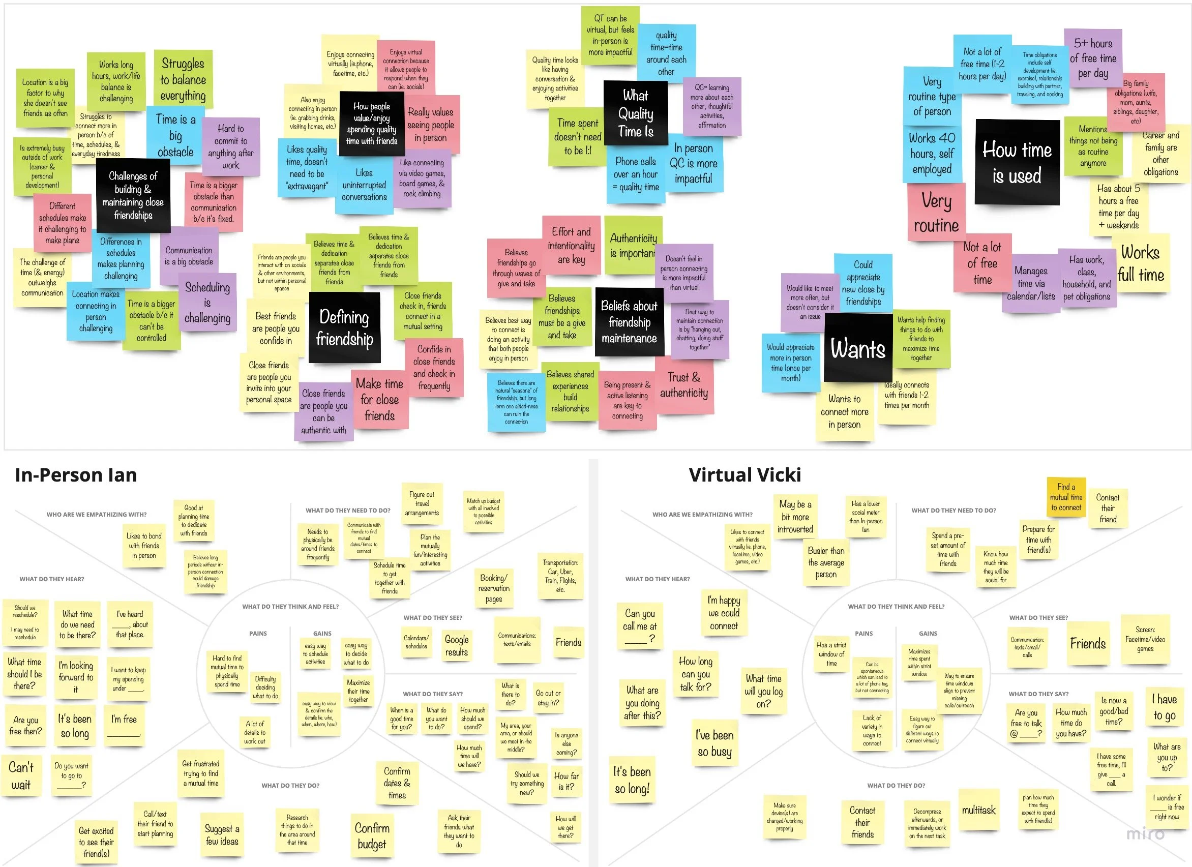
Affinity Map (top) & Empathy Maps (bottom)

Personas
Creating personas helped me understand exactly who my target audience is.
Discovery

Virtual Vicki
May be somewhat introverted
Lives further away from close friends than the average person
Interested in connecting virtually beyond a phone call
“I want to experience new things that I know we would enjoy, but our schedules never seem to align. I need a fast and efficient way to organize plans with my close friends.”
“I don’t have much time and my schedule is sporadic. I need easy and effective ways to connect with my close friends virtually.”
User Personas
In-Person Ian
Requires an in-person connection
Has a busy or non-traditional schedule
Doesn’t have time to look into things to do
Ideation
Brainstorm
Ideation
HMW Exercise
By looking at the "pains" and "gains" of the two personas, I built "How Might We" (HMW) statements. Here are a few examples:
How might we make scheduling plans and communication feel quick and easy?
How might we give adults a variety of activity options to connect with friends, both online and in-person?
How might we make planning feel effortless?
How might we help friends have a reliable "source of truth" for making plans?
Crazy 8s
The HMW statements guided my ideas. I did a Crazy 8’s exercise and came up with 8 sketches that shaped my user stories and designs.
Here are a few below.

User Stories
Based on my Crazy 8’s exercise, I wrote 16 user stories.
I categorized each story into three groups:
Must Haves
Nice to Haves
OK to Not Have.
This helped me decide which screens the app needed. Below are a few examples:

Ideation
User Stories
Must Have
As a user, I want to schedule things to do with my friends, so that we can connect and spend time together.
As a user, I want to group friends together, so that activity logistics can be seen in one place by all parties.
As a user, I want to centralize logistics with friends, so that we can quickly make a unified decision.
Nice to Have
As a user, I want to save activities I’m interested in, so that I can share them with my friend(s) at a later time.
As Virtual Vicki, I want to know how long an activity will last, so that I can prepare my schedule accordingly.
Site Mapping
I took 1-2 actions from each user story and grouped them into different categories. These groupings helped me identify the primary pages, as well as the secondary and tertiary pages, and determine where they would best fit.
Ideation

Site Map
User Flows
I created user flows to understand how users would perform specific functions in the app:
Adding a friend
Accepting a plan request
Sending a plan request
This helped ensure that I wasn't missing any actions or screens and that the process was as seamless as possible.
Ideation

User Flows
Sketching
I selected a few ideas from my Crazy 8s exercise and sketched every page needed to illustrate the user's journey through the 3 most important user flows. These sketches laid the foundation for my wireframes.
Ideation

Sketching
Wireframes
I transformed my sketches into low-fidelity wireframes in Figma, then added real text and icons to create medium-fidelity wireframes.
The goal was to prioritize functionality and create a seamless, efficient experience for our adult users.
Ideation

Wireframe Examples
Design
Brand Platform
Famble was designed to feel approachable with a warm, welcoming tone, making it easy for busy adults to spend quality time with loved ones. This approach is reflected in the colors and simple typography shown in the mood board and design system.
Design
Mood Board

Style Guide
Mood Board
I aimed for the brand to feel fun, relaxed, and "down-to-earth." I chose warm, muted colors to be inviting yet mature.
Style Guide
To ensure simplicity, I avoided large and intricate fonts, using minimal icons to keep the app from being overwhelming.

Hi Fi UIs
I created high-fidelity wireframes based on the initial wireframes to prepare for prototyping. See below.
Design
Log In
Homepage
Plan Details - Accept Plans
Friends Page
Friends Search Page
Friend Search Results Page
Friends Page - Friend Requested
Plant Details - Invite Friend(s)
Testing
Usability Testing
The usability test was conducted remotely via Zoom to assess the flow and user experience of Famble's three main functionalities. Five users were introduced to Famble and asked to complete the following tasks:
Add Tracy Green from New York as a friend.
Accept a paintball event request from your friend Sam Little.
Send a recommended bar crawl in NYC to your friend Joy.
Testing
Issues Found:
Users struggled to find the “pending plan” request on the homepage.
Users felt they didn’t have enough information to accept a plan.
Users felt they didn’t have enough information to send a plan request.
The Redesign
Testing
Confirmation & Requests
I split the confirmation and request processes into separate screens to streamline the user experience and reduce clutter on the "Home" and "Plans" screens. Usability testing showed users often clicked on plans for details, guiding us to prioritize displaying plan details and remove unnecessary calls-to-action.
Optimizing the Home Screen
I revamped the homepage by removing irrelevant sections, focusing on key information like upcoming events and the user's top friends. These changes aimed to improve usability and event management, aligning with our core objectives.
The Prototype
Testing
Impact
Broadening the Audience
My research revealed that maintaining relationships is a challenge not only for 9-to-5 workers but also for full-time students and stay-at-home parents. This crucial insight expanded our target audience, ensuring the product addresses the needs of various groups.
This realignment was instrumental in shaping the B2C mobile app, making it more inclusive and relevant.
Simplicity Drives Adoption
Initial designs were overly complex. User testing and feedback highlighted the importance of simplicity in enhancing user experience.
This led to a streamlined, user-friendly app that effectively meets the needs of busy adults. This transformation showcases how thorough research and iterative testing were vital in shaping the final product.
Thanks for Reading!
Thank you for reviewing my Famble case study. Feel free to reach out with any questions or for further discussion.