
VIEWSTATS
by MrBeast
Leading Design for ViewStats’ First iOS Experience


Note: This case study contains limited visuals due to an NDA and my departure from the company before the app’s launch. All visuals shown are final screens from the current version of the app (as of April 2025).

Viewstats is an analytical web application that provides YouTube creators with insights that guide them to make data-driven decisions to grow their channels.
What is Viewstats?

My Role
UX Design Lead & Manager
The platform started as a data-heavy desktop product, but as more creators asked for on-the-go access, the company decided to invest in a native mobile experience.
The challenge wasn’t just to shrink the desktop site, it was to rethink how creators check stats between posts, compare channels in seconds, and explore trends while on the move.
The Challenge


Research & Direction
Because the mobile YouTube analytics space is relatively underserved, I encouraged the team to explore inspiration from financial apps like Robinhood and Public.
These tools deal with complex, dense information in small formats, using cards, visual summaries, and progressive disclosure.
Looking for Inspo

Key insights:
Use visual hierarchy to prioritize digestible insights
Enable scroll-first, tap-later interactions
Reduce dependency on dropdowns and modals

Public App Screenshot
Approach & Design Process
Build the Foundation First
I prioritized lower-complexity screens to establish our mobile system:
Home (search + discovery)
Top Lists
Favorites
My Profile

This allowed the team to quickly define:
Visual patterns
Layout rules
Color tokens and more.


Top Lists
Home
Profile
Favorites
Complex Flows & Deep Data
With the foundation set, we moved to more complex interactions:
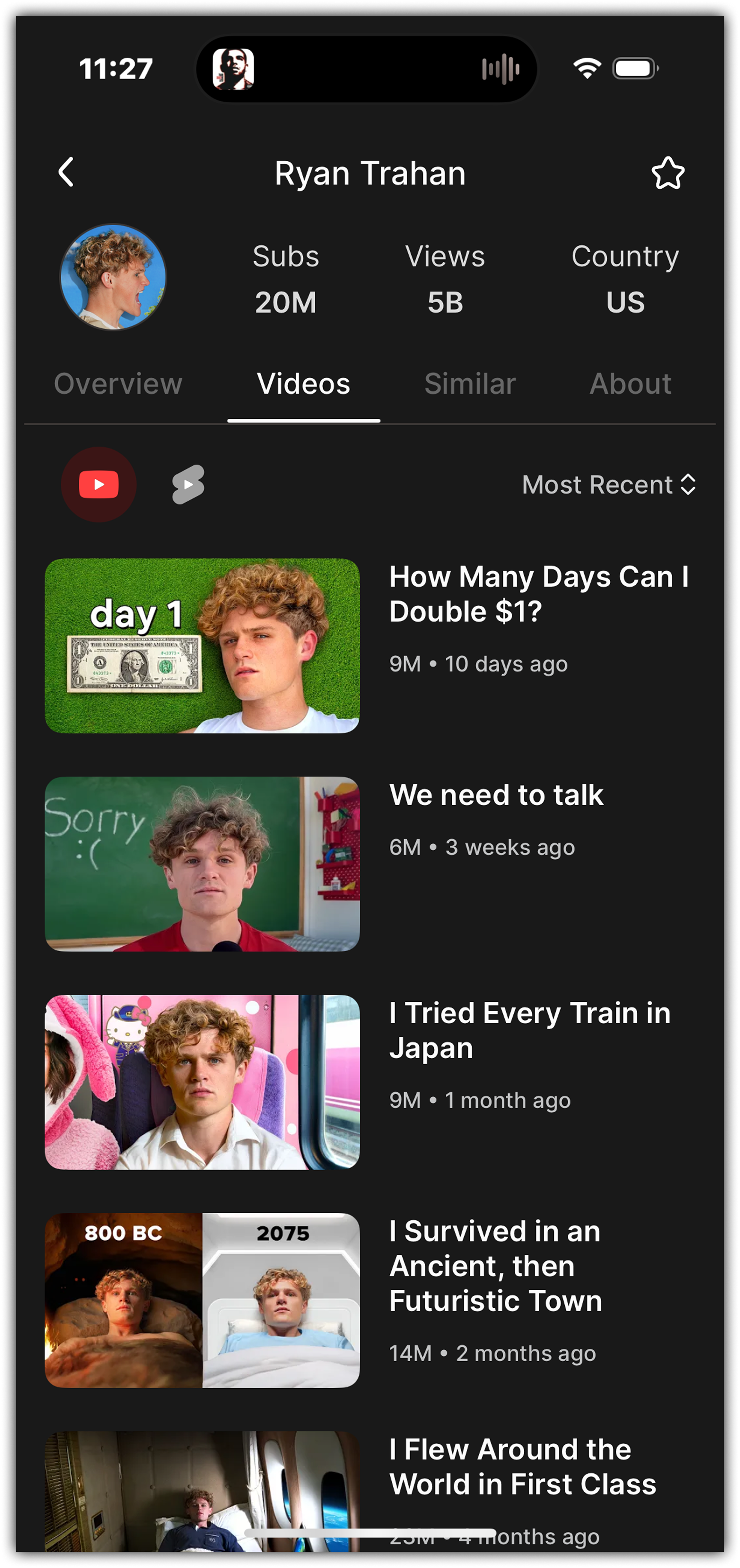
Channel Overview (tabs for videos, similar channels, about, etc.)
Video Detail pages (views, engagement, A/B tests, title changes, etc.)

Channel Overview
Channel Overview - Scroll
Channel Overview - Scroll More
Channel Overview - Scroll Bottom
Video Details
Video Details - Scroll

Video Details - Change Gallery


We used scrollable cards and lightweight tabs to help users consume more information without feeling overwhelmed.
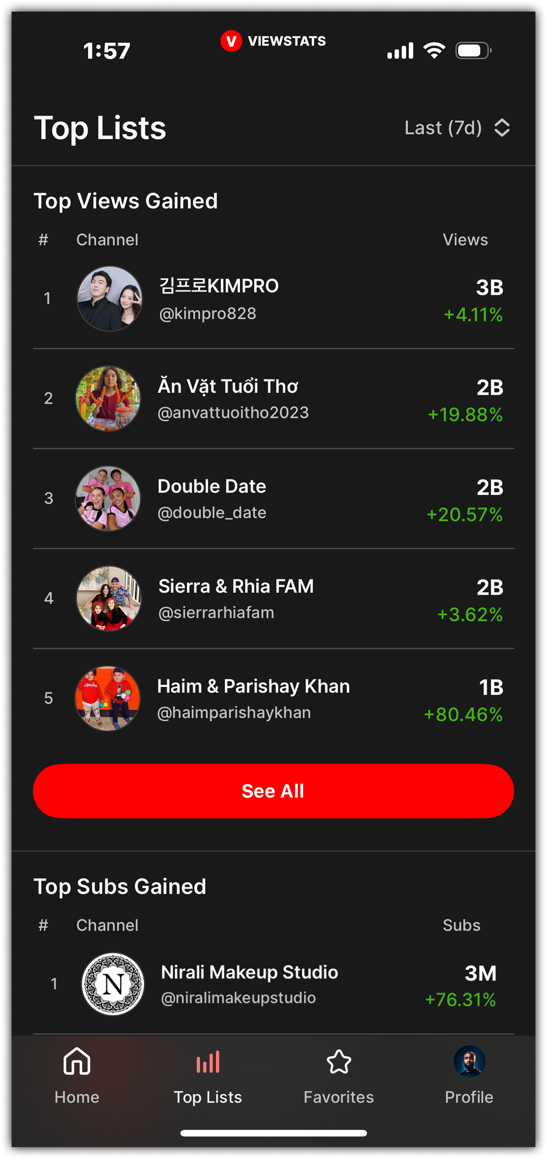
I proposed and designed a new module for the Channel Overview page, "Current Top Lists."
This feature did not exist in the desktop version and was developed specifically to enhance discovery and add contextual relevance within the mobile app.
This helped reinforce a creator’s relevance without requiring a separate search.
My Addition: “Current Top Lists”
Channel Overview - Scrolled
Top Lists
Final Screens

Home - Top

Home - Bottom

Channel Overview - Top

Channel Overview - Bottom
Channel Videos

Video Details - Top

Video Details - Bottom

Channel About
Top Lists - Top

Top Lists - Bottom

Full Top List Page

Favorites
Collaboration & Leadership
Mentorship & Guidance
Led daily design critiques and feedback sessions with 2 designers, helping them grow in clarity, consistency, and user-centered thinking.
Product Planning
Defined priorities weekly with the PM, balancing feature feasibility with user value.
Cross-Functional Collaboration
Owned all design-to-engineering collaboration, from spec documentation to QA reviews.
Platform Partnership
Worked closely with iOS developers to ensure adherence to Apple Human Interface Guidelines and to address platform-specific design challenges.
Outcome
From Figma to the App Store
Although I wasn’t with the team during post-launch measurement this was not a handoff-only project.
I led the product and design process from early wireframe decisions through to the final iOS build, ensuring that the visual and functional goals aligned across teams.
My work involved:
Crafting key flows and patterns for mobile-first usage
Directing internal design reviews and iteration cycles
Partnering closely with engineering for implementation

Reflection
This project challenged me to balance leadership with hands-on execution. It sharpened my product thinking around mobile-first data visualization and helped me grow into a stronger communicator and collaborator across disciplines.
Most of all, it reinforced that great mobile design isn’t about compression.
It’s about clarity, hierarchy, and timing.